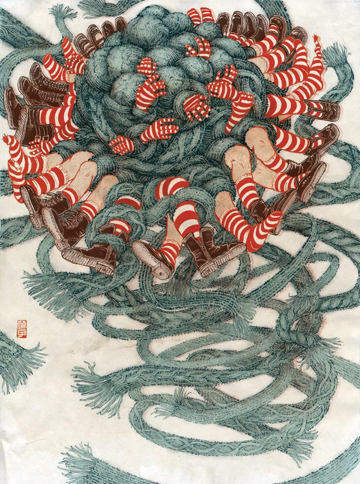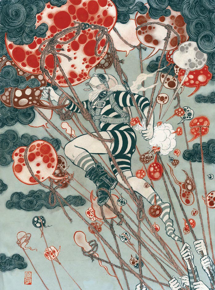
Yuko Shimazu Yuko Shimazu Yuko Shimizu

Award winning Japanese illustrator based in New York City and instructor at School of Visual Arts.

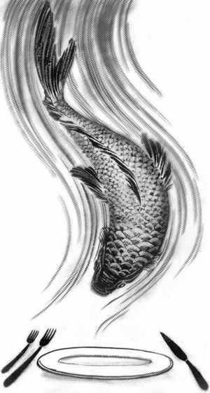
Quick Fish

Quick Fish Illustration

Many of the jobs I do, it takes hours and hours, sometimes days and days of drawing. It was not my original intention, but during the course of close to 10 years of working, I somehow became known as an illustrator who does detailed works.
Not that I have issues with that, but maybe because of that, I don’t get calls to do a lot of New York Times Op-Ed illustrations. A lot of fellow Drawgers work on them on regular basis. But I don’t even recall when was the last time I worked with them. (I do work with The New York Times in other sections quite often.)

When Alexandra Zsigmond of Op-Ed called me for today’s paper, it was no brainer to just do it. I was craving for: 1) quick drawing that starts and ends in half a day 2) topic that is not related to my home country of Japan, as I have been working on so many of them in recent months.
It was a fun story by Ray Holborn about that we should not feel guilty eating fish, because in a long run, it is a lot more sustainable than making your main diet meat based.
While “Japanese people eat sushi every day” is a total American myth. I can indeed eat sushi every day, or three times a day if I can, so the article was a great news.
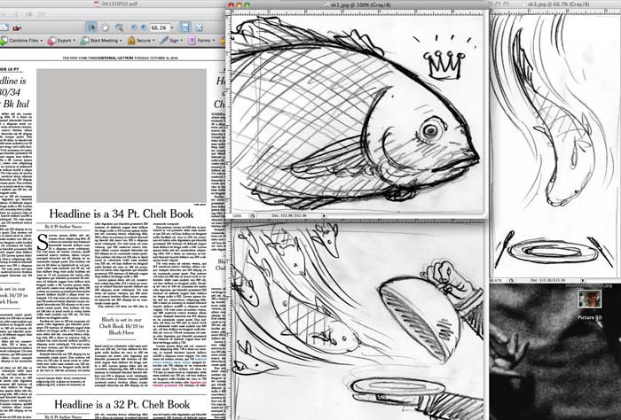


Quick Fish sketch

originally, composition was horizontal. Alexandra sent me a mock dummy (left) and I made two sketches according to the shape (center) as well as one (right) that worked vertically.
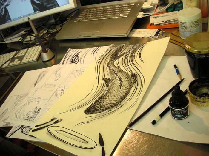
Quick Fish process

They liked the vertical sketch. I drew the final around 2X the print size on watercolor paper using brush and india ink.
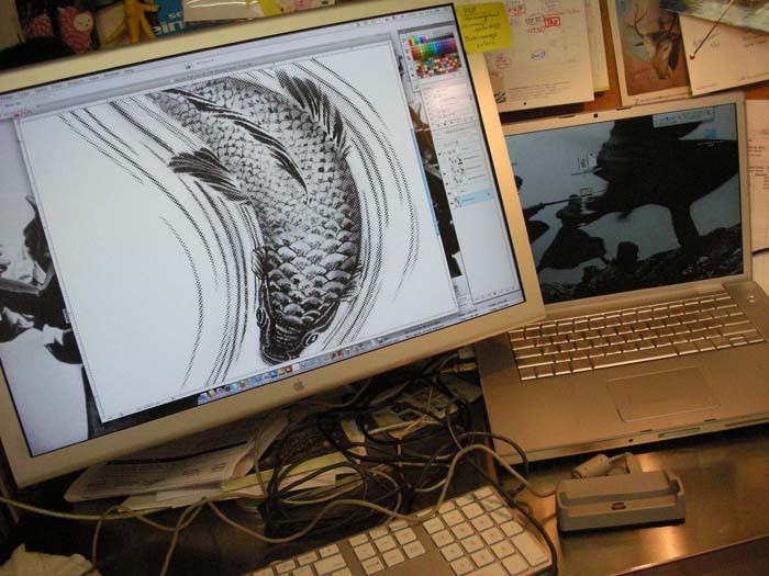
Quick Fish process 2

Then, digital manipulation of the work. Originally, I was thinking of making the water-line lighter, and add gray scale to the fish. Then after I started playing around, I decided not to do either, but just multiply the same drawings and add very slight effects.
Quick Fish process 3

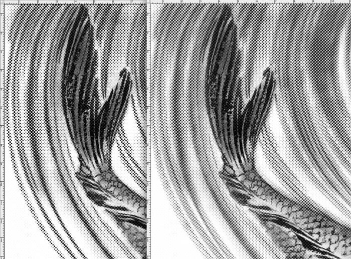
Most of the time when I do digital manipulations, they are things you don’t even notice if you only look at the final. I call them ‘secret layers’, not because they are secret, but because you won’t even notice them. In this case, I blur-ed the water line by manipulating on the computer (right), and the left one is before the blur. Very subtle change, but this layer adds a lot of depth and movement to the image.
 

Quick FIsh full illustration

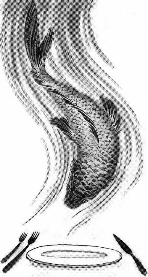
final piece. I made many small changes and printed out many times till I was happy with the result.
 

Quick FIsh NYT papers

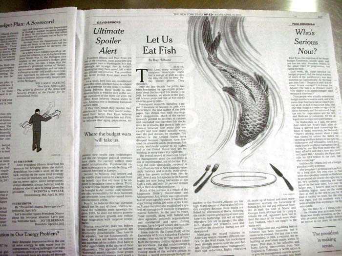
Today’s NY Times. What was really cool surprise was to find my friend Jason Lee’s illustration right next to mine (left). Priceless.


When I got a call of approval from Alexandra around 5:30, I decided to pack up my stuff (and my dog) and leave the studio early. Yes, I have other work to take care of, but they can wait. It was just too nice to be inside.
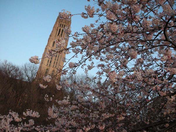
We walked along the Hudson River for about 40 blocks (half of the time, my dob wanted to be carried around. He is a 4 pound dog after all), and enjoyed the Someiyoshino Cherry flowers in full bloom.
Quick Fish cherry blossom 1

Someiyoshino Cherry and Riverside Church tower
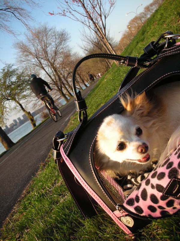
Quick Fish cherry blossom 2

He was in happy mood that he does not need to wear sweater to walk outside.

Quick Fish cherry blossom 3

Yae-zakura Cherry was starting to bloom too.


Art In The Time Of Disaster

art in the time disaster
this image was taken from fastcodesign.com I have been learning about a lot of things in last ten days. I have been learning a lot about what has happened in Japan. I have learned how to watch TV news on my iPod, how to get my calls go through to my parents without busy signal (sometimes I have to call like 10 times), or collect enough information from various sources to assess what is right, what is wrong and what is just pure lie. But more importantly, I have been learning a lot about responsibility of art and being an artist. This is a rare moment when I look at the world and the world of art and design from a victim’s point of view. Well, I am technically not a victim. My family and friends are doing OK, although going though some tough times and inconveniences. I don’t even know a single person in the area directly hit by this disaster. Yet, the world outside Japan sees “Japan as the victim” and treat us, Japanese people abroad, as victims, and therefore, for the first time (and hopefully the last time) I am seeing the world from a completely different point of view. I contribute illustrations to newspapers and news magazines. I do illustrate tough topic like ongoing war. But I have never had a chance to stand on  the point of the view of what has getting illustrated. And then I got this link to Fast Company blog post by  John Pavlus. He captured my unorganized thoughts for the last ten days into very easy to read article which makes you think, regardless of you agree with him or not. I wanted to share this with you, especially that those who are reading this are mainly people in the creative field. http://www.fastcodesign.com//1663419/is-this-poster-to-aid-japans-tsunami-victims-a-design-crime I personally do not mind the specific poster in question here. At the same time, I cannot agree more with Mr. Pavlus’ view toward design (in general) during the time of disaster, and responsibility of the artists who create them. Aren’t some of the designs popping up on my and your facebook links, just too quick, too easy, and too smart, and sometimes feel like each designer is rushing to create the most clever image? Doesn’t it sometimes feel like it is a competition of a sort? Did they even have enough time to research the subject matter, do they know about the specific areas in Japan and culture, or did they think through of what was the message in the images  before creating the images in rush? If it it was too long to read my mumbling, you can skip and just read here: During the time of disaster, those who are affected need to see sympathy, hope and encouragement more than anything. The last thing they want to see is another image of disaster, like a blood spilling flag. This is something I have learnd that wanted to share with you today. Let us show them hope. Because with our pens and brushes and computer mouse, we can. Thank you very much for those who read all the way down to here. PS (this section was added later) Thank you for all your comments. I know, once a blog post is up and people start commenting, it start to take life of its’ own, and people do start talking on the topics that were not necessarily the intention or the main topic of a post. But that is just the nature of it. I just wanted to add this section (previous section is the original post, I have not touched or revised it.) to explain my intention. It is not an attack against the creator of the poster that I used the image of (I used it because it was the top page of the original post by John Pavlus). I did mention that I did not mind the particular poster (actually, it is one of the better ones). And, whatever done for charity, and raising money: great. I am not complaining about the charity itself, and I believe neither did the original author John Pavlus. Whatever good intention rules, no doubt about that. I know people have ideas toward whether it is an exploitation, shameless self promotion, etc, etc, well, I have no comment on that, that was not the part of my intent on this post. It is the images (self-initiated) themselves, initiated by thousands of pro and armature artists and designers, popping up on internet even quicker than the actual detail of disasters unveils (it is ongoing), and many of them (not all, but many) seem so quick, so careless, so research less, and often feels like people are on competition who is the one to post the most clever ideas the fastest. How many of those who had created them can explain the meaning and controversial feelings of Japanese people toward the Hinomaru flag. Or, know about the area of disaster. Like, if you ask any American about the area where Katrina hit, they have pretty good idea and knowledge… for example.) Most importantly, I wanted to know that the people who are facing disasters in far away land need encouragement, support, hope and sympathy more than anything. I wanted each artist who is reading this, or thinking of creating some art/design work related to this or any other disasters happening around the world, to have that in mind when creating.

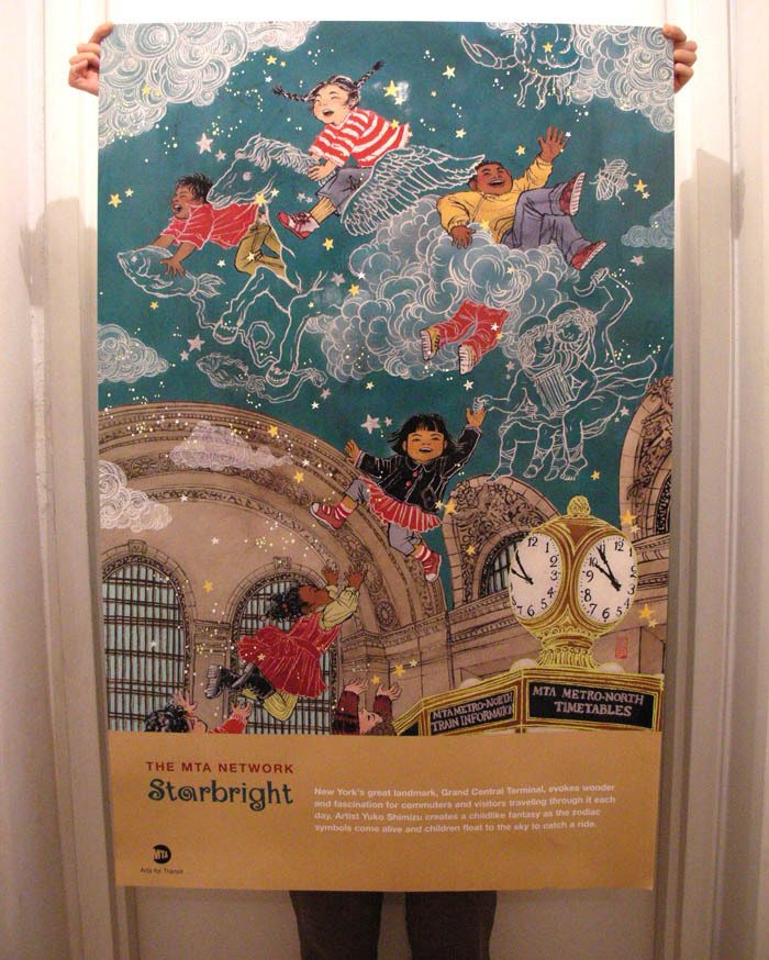
Grand Central Terminal

MTA Poster (small size)

It will be a while till you will start seeing them at subway stations in New York, but I just got my copy of the MTA  poster and got excited, so I wanted to share it with you a bit early.

MTA Arts For Transit usually commission around 3 artists a year to create posters. Posters are usually posted around NYC area subway and train stations and stay there for a few month.
I (and often my dog) take subway down to my studio from my home every day. It is very much a part of my life. (always buy 30 day unlimited pass!) So, it was obviously very exciting I was chosen as one of the three for 2011.

The challenge was that the audience is “everyone who uses MTA subways, busses and trains”. It is easier to come up with ideas when the audience is narrow and targeted. To make something that is ‘for everyone’ is so broad, I was at first a bit lost.
Then soon, I organized my idea and decided to work with something that relates strongly to my personal experiences.


MTA Poster photo 1

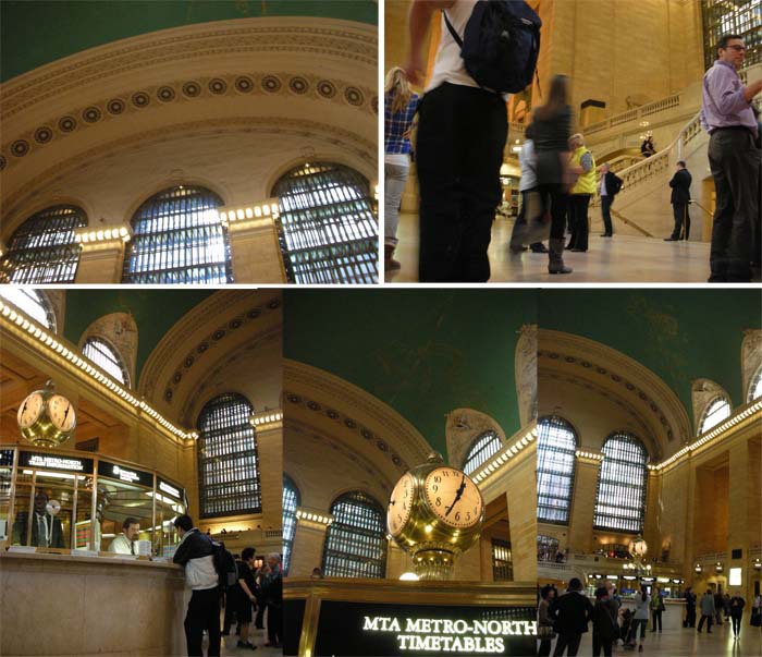
I decided that the best way to come up with ideas for sketches was to actually go there and walk around. I took many pictures, most of them from the kids’ height, to get the sense of how this place look for children.

As a kid, I lived in a New York suburb for 4 years. My father, who had a job in an office in Pan Am Building (now Met Life Building) which is directly connected with escalators from Grand Central Terminal, commuted on Metro North commuter railroad every day.
Once in a while, my parents took me and my sister to come visit Manhattan on the same train. I clearly remember arriving at Grand Central for the first time, walking into then very dirty but still very stunning main concourse and  looking up at a huge ceiling of stars and my jaw just dropped.

It was 1977. Grand Central was beautiful, but dingy. My mother told me to always stay with her while walking through the concourse, and never to use public bathrooms at the station. A lot of the store fronts were closed. There were a few that sold cheap coffee or egg roles.  I liked them as a kid. I still think about the egg role treat we ate on the train on the way back  to our home in Westchester, and kind of miss it.

Now, I walk into all the fun stores that sell everything from gourmet food to fancy gifts, and I use their clean bathroom. Restored ceiling is bright and shining in my favorite color: teal. But every time I walk back into Grand Central Terminal, I feel like I  become the kid in 1977 again.
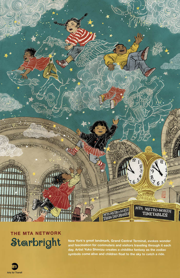
By the way, the Asian girl on the top of the illustration is me. Of course, me when I was younger.

If you are interested, you can own this poster, and the proeeds help to maintain the Transit Museum.
Big thank you to Amy Hausmann and Lydia Bradshaw of Arts for Transit.

MTA Poster sketch 1

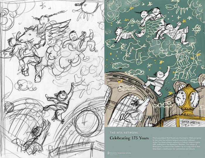
the accepted sketch is on the right. All my sketches usually starts from very loose composition roughs, like one on the left.

MTA Poster sketch 2

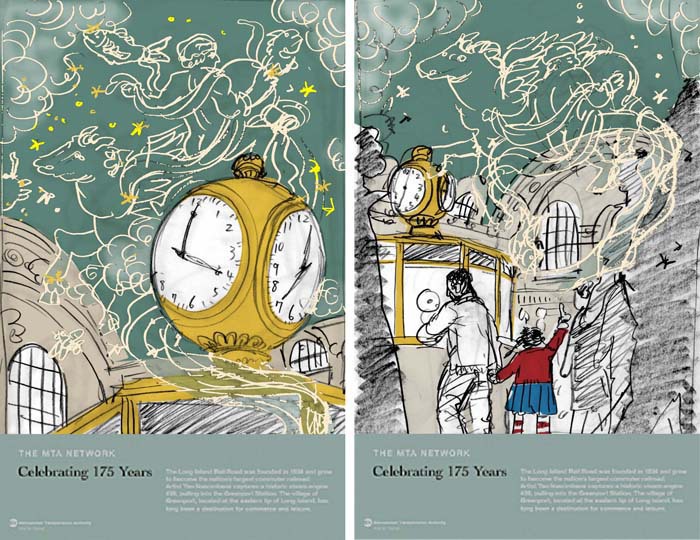
two other variation sketches submitted. On the left is the most ‘adult’ looking piece with no people. On the right is a kid looking up and imagining, as all the busy people walk her by. the banner on these sketches are dummy I just took from a previously published poster, just to give a sense of what it would feel like with the complete poster look.

MTA Poster (big size)

Final poster image.

MTA Poster photo 2

My friend Ai-chan posing with hot off the press poster. Yes, it is HUGE! Although it does not look that way when you see it at stations near you.


My Dog, A Proud Mexican!

I aquired a five year old dog last May. It was sort of like an accident. I was not looking to get a dog, well, not just yet. He just decided to be part of my lif.
Since then, I cannot think of a life without him.
He is sweet, friendly, well behaved, and keeps me great company.
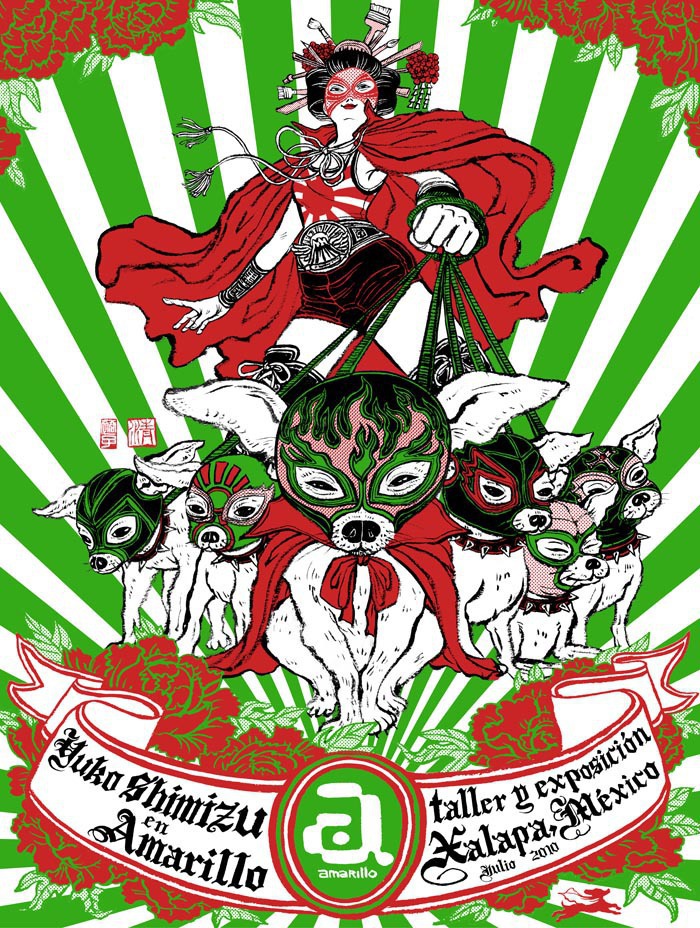
When I was going to teach a workshop in Mexico last summer and needed to create a poster to announce the event, I wasn’t sure what to pick as a subject. It should be something Mexican, but it shouldn’t be a typical cliche.
Then I looked at the couch in my studio where he sleeps just like he always does while I work. Oh, of course, this is it! He is a proud Chihuahua, a Mexican. What is more appropriate than drawing him in the poster?

He became a bit of a star in the small town. Only thing was taht has was actually not there. Next time I am flying out to Mexico, he should come with me. See the motherland himself.
Happy Valentine’s Day to you all.

My dog, a proud Mexican poster

six of my dogs on the poster!

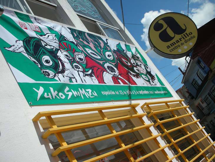
My dog, a proud Mexican photo 1

he was depicted on a banner to announce the show and the workshop


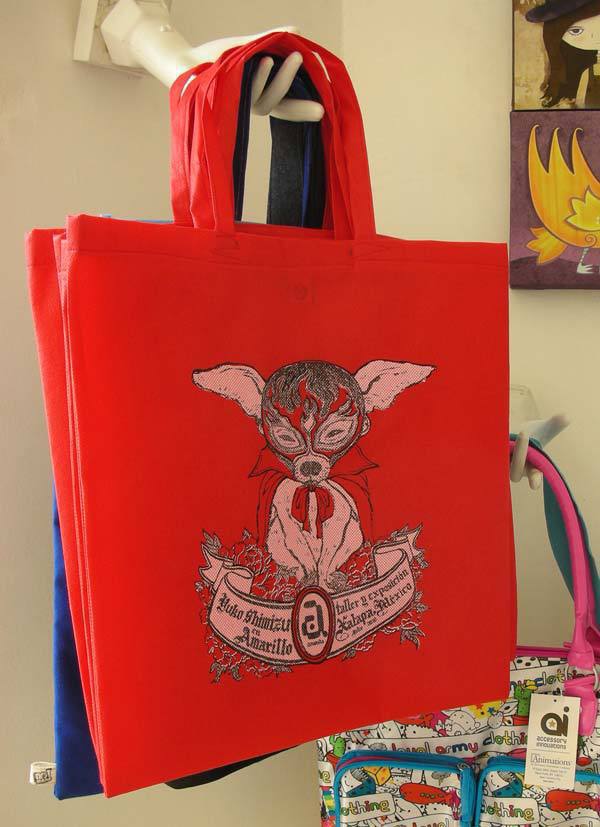
My dog, a proud Mexican photo 2

he was also made into a tote bag (sold out)


My dog, a proud Mexican photo 3

he was seen around town of Xalapa, Mexico like this during the exhibition.


My dog, a proud Mexican photo 4

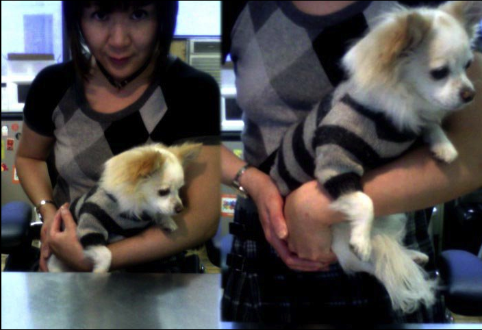
This is him in real life. We have matching outfit. (I don’t dress dogs, up. He just needs sweater in this weather.)


Currently At The Society Of Illustrators

Ah! It’s ben SOOOOO long since I have posted anything here. I tend to try and wait till I have enough time to write a good process post. And that time has not come for a while. My life has been hectic since last fall. I finally gave up on the idea of keeping ‘one person office’ and started to have an awesome helper come in once a week to keep track on office stuff. It’s been amazing.
Soon, I should be able to get back to posting more.
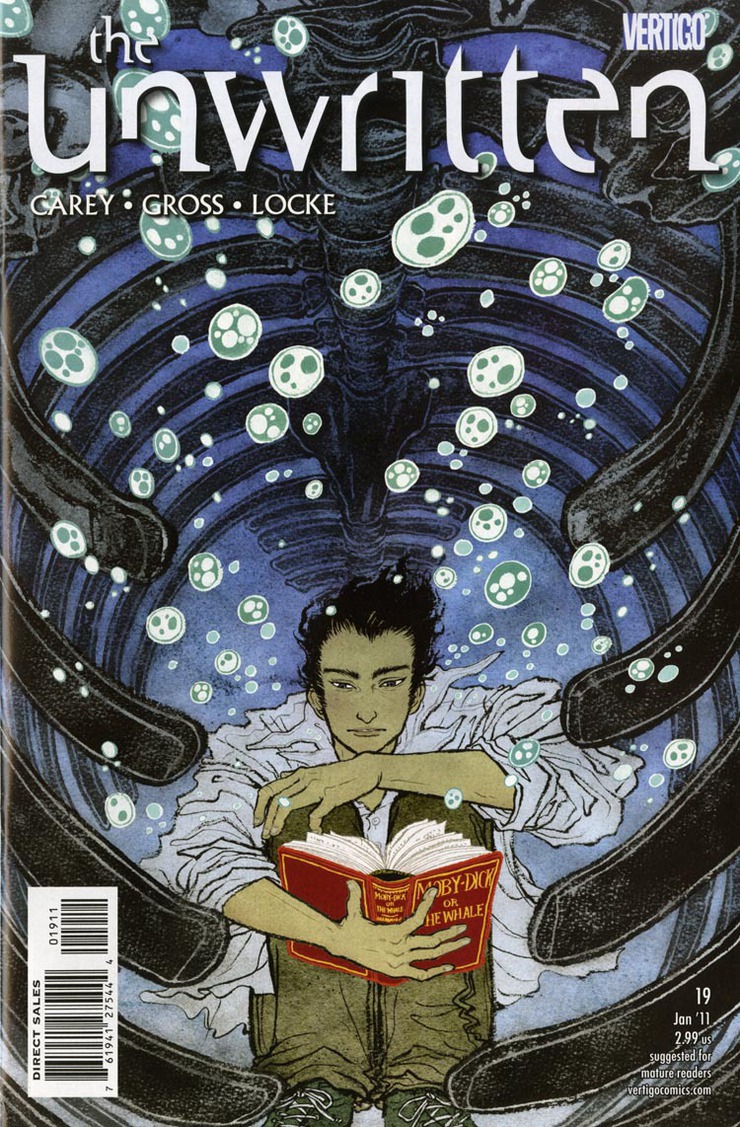
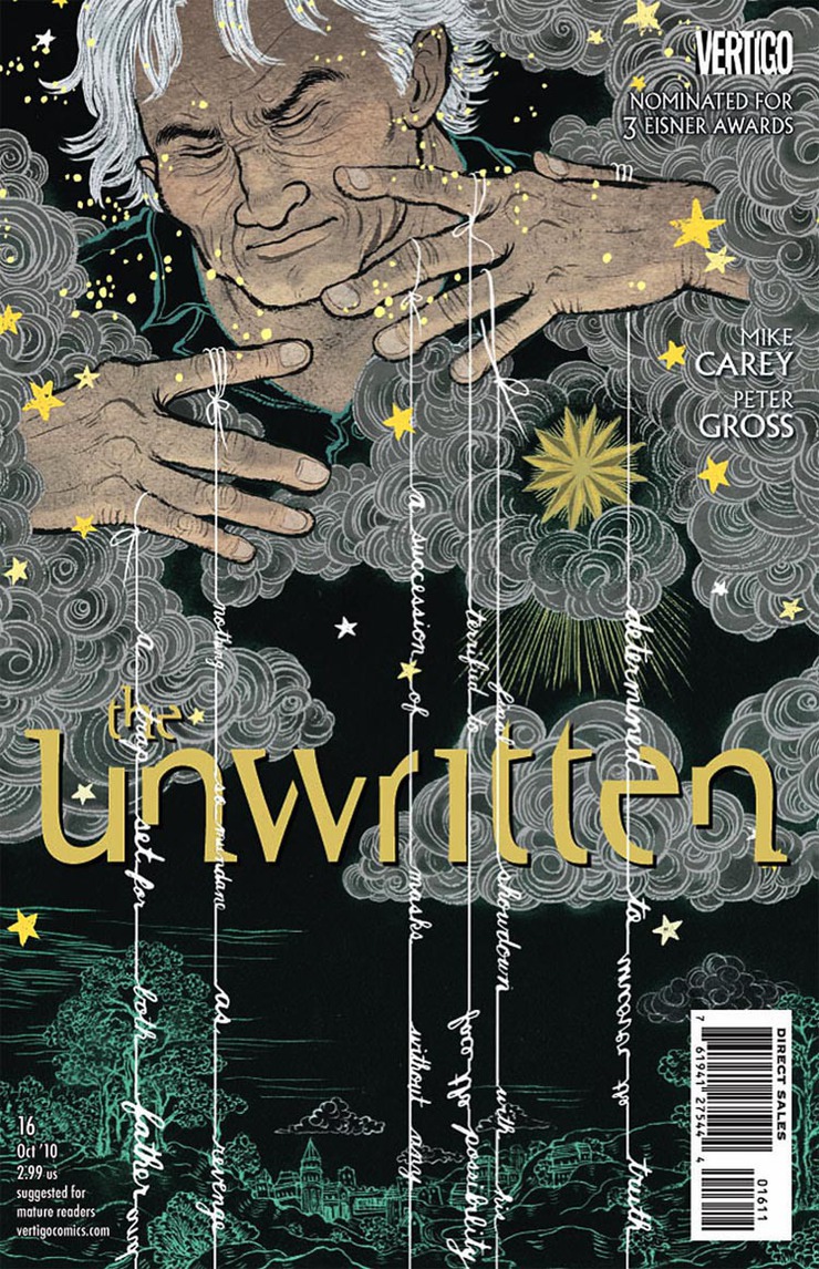
But for now, rather than keeping quiet, I decided to post three images that are currently being shown at the Society of Illustrators Editorial and Book show. Two of the covers from DC Comics Vertigo series The Unwritten (editor: Pornsak Pichetshote). And the double page spread opener which I recently finished for PLAYBOY (AD: Rob Wilson).
I will try and post process of those images soon.

Currently at the society of illustrators 1

The Unwritten #19 cover. I remember working on the sketches while teaching a workshop in Mexico….


Currently at the society of illustrators 2

The Unwritten #16 cover.


Currently at the society of illustrators 3

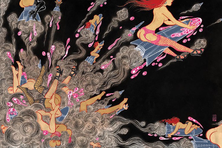
This image was recently created for PLAYBOY. Double page spread opener.

Vampires & Diapers.

Vampires&Diapers cover (small size)

I totally judge books by their covers.
Let’s be honest, we all do. I can be categorized as a book-worm, but still I always have piles of unread books sitting around in my apartment, mostly because I couldn’t resist buying them for their beautiful covers. To add to this, I have countless design books on book covers, also piling up. I just bought one yesterday, and was drooling on it all last evening. (check this out: The Art of American Book Covers 1875-1930 by Richard Minsky)
When John Gall, one of my favorite contemporary book designers, contacted me for 30 Covers 30 Days challenge, it was like dream coming true. I still secretly have a list of people I would LOVE to work with, and he was obviously one of them, for my love of his gorgeous Haruki Murakami covers, 10 times better than the original Japanese version. Drool.

Non profit organization National Novel Writing Month encourage people to spend November writing the first draft of a novel. John’s idea was to invite 30 designers and illustrators, each create a book cover, start to finish, within 24 hours from the brief.
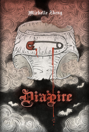
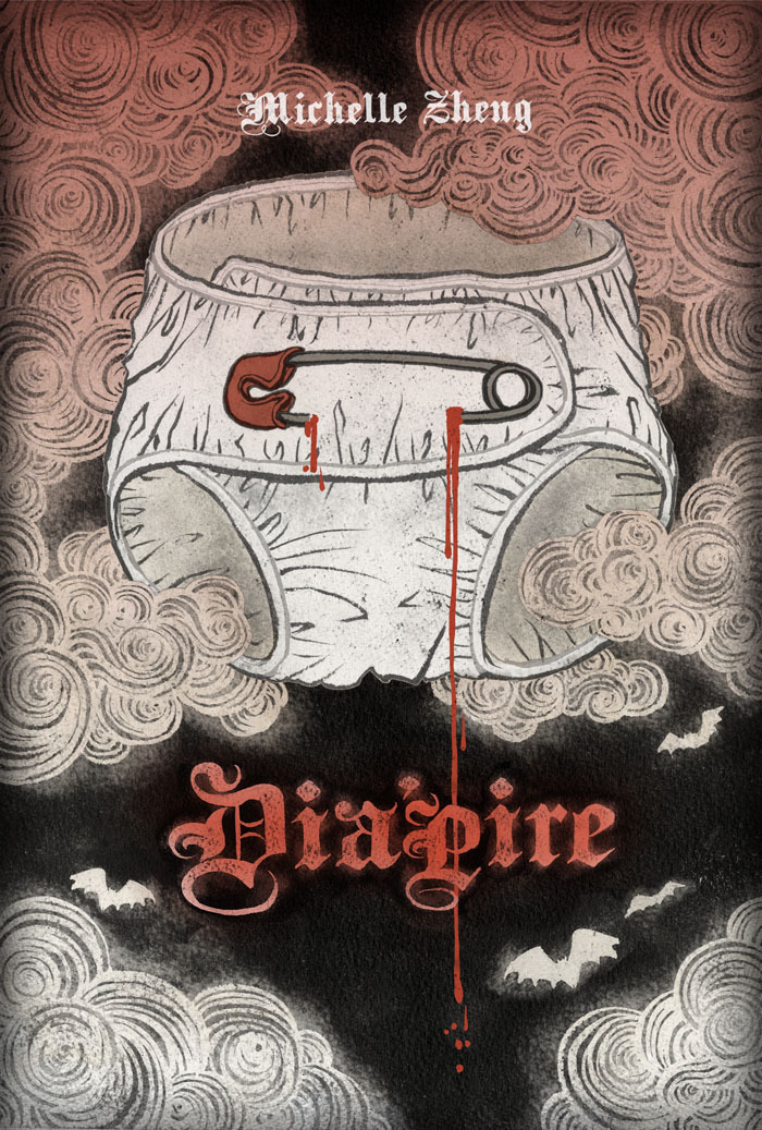
Mine was on November 29th, I was given three synopsis to choose from. The one I picked was Dia’pire by Michelle Zheng. Story about a pathetic  and funny diaper wearing vampire.


There are some amazing covers created by amazing talent, all within 24 hours, and you can see all of them on the link here.

vampires & diapers photo 1

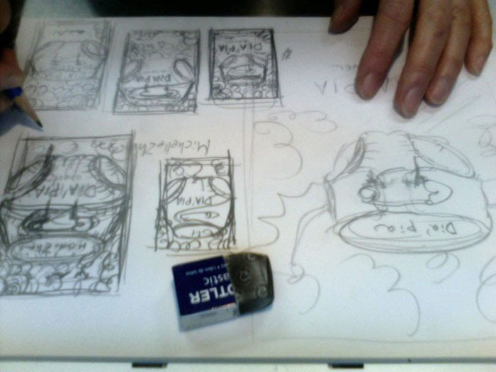
It was a no brainer for me to pick this synopsis. This was the funniest. Besides, during the 90s, my religious view was “Anne Rice”, for real. Thumbnails, thumbnails, thumbnails.


vampires & diapers photo 2

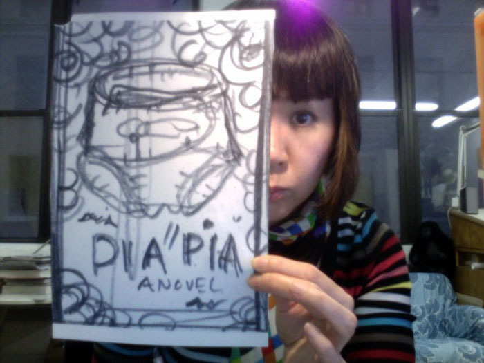
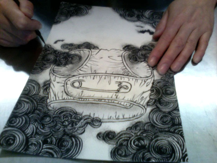
Pick one of the thumbnails I like the best, blow up to the size I want to draw. Cut watercolor paper to the size, get my ink and brush, then go dive into the drawing. I don’t have much time!!!


vampires & diapers photo 3

eerie and funny… that is what I am looking for…


vampires & diapers photo 4

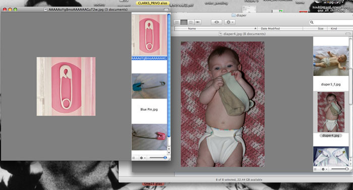
I don’t have babies nor particularly into them. What do diapers and diaper pins look like?? Yeah, those authentic cloth diapers, of course!


vampires & diapers photo 5

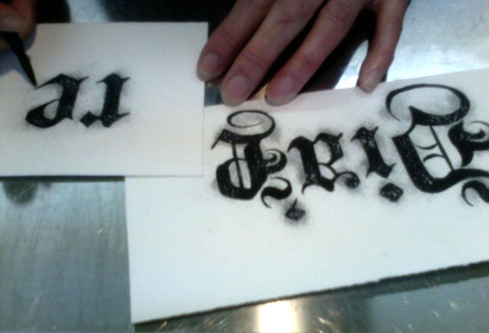
Know nothing about type. How sad, but true. At least I can tell what looks good. vampire: gothic type, duh. So, to hide my non-knowledge, I carefully hand draw each type, so it looks better than it actually is.


vampires & diapers photo 6

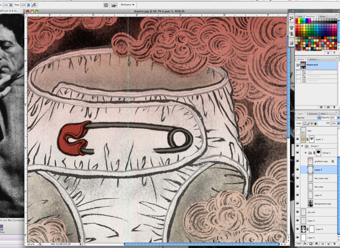
Photoshopping….


vampires & diapers photo 7

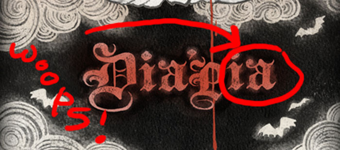
How ESL of me. Didn’t I know that it would never spell “vampia”????. Go back to the drawing table to fix this up.


vampires & diapers photo 8

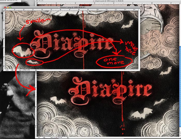
minor details: the bat drawings in the original drawing were needed to shift, move and flip around, because after the title type was in, they didn’t work the way they were originally intended. After a lot of back and forth on where they should be, the final result is as below.


vampires & diapers cover

Finished!! All within 24 hours or less. Phew! But I am so nervous if it lives up to all the beautiful 29 other covers other designers have created. Either way, I had FUN!!!


“Life” According To Keith Richards

People often ask me: “what was your very favorite assignment?”. Now, this one is hard to answer. Every assignment (or at least, most of assignments) is fun in different ways. Sometimes because I love working with that AD, another times because the client let me do whatever I want, or article is interesting, good fee, etc, etc. But I have to admit, every once in a while, there comes a project that I tell my self “Yes! I have been working as an illustrator to get this assignment!”.

And, this was one of them.

Rolling Stones came to Japan for the first time, yes, for the first time, in 1989, for Steel Wheels world tour. Japan is known for their strict drug law, therefore, Rolling Stones was banned from entering Japan, for precaution, until then. Did you know that Paul McCartney ended up in Tokyo jail for possession of small amount of marijuana in the early 80s? Paul was allowed back in first time since his arrest on the same year, if I remember correctly.

All the ultra-expensive Rolling Stones tickets got sold out in like 30 minutes. I was so sad, I ended up begging the president of an ad agency I worked with (I was working in a PR department of a big corporation  back then) to get the tickets. And then, the first Rolling Stones concert… I was in heaven.

Nicholas Blechman, AD of New York Times Book Review, somehow must have sensed that I am a Rolling Stones fan. I don’t know how. But he also knew I am a Keith Richards kind of a girl. (I am, with little skulls here and there…) He said: “I thought you would enjoy drawing all the lines in his face”. I did, Nicholas, I did. Thank you.

Keith’s autobiography “Life” is now in bookstores near you. Oh I should get a copy too!

As you may be able to tell…, it initially came as a cover gig. Unfortunately my illustration defeated against a photo of younger hotter Keith. But it is OK, ok. Four ideas were submitted. they went for the most simple idea.

Approved sketch is blown up to the size I want to draw, traced into a watercolor paper. Then I use reference photos to get the likeness right in pencil.

Ink drawing in progress. He looks much older in this one, because all the lines in his face are solid. In coloring stage, lines are lightened to various tones.

Nicholas said he has seen many Keith illos in many magazines but a lot of them are not flattering portrait of him. As fans of Keith, we decided the direction is “let’s draw him in a way if he sees it it is a flattering portrait of him”. I hope I did that right…

On the page of NY Times Book Review, from the last weekend.

My Friend Ryan

Ryan Rivera

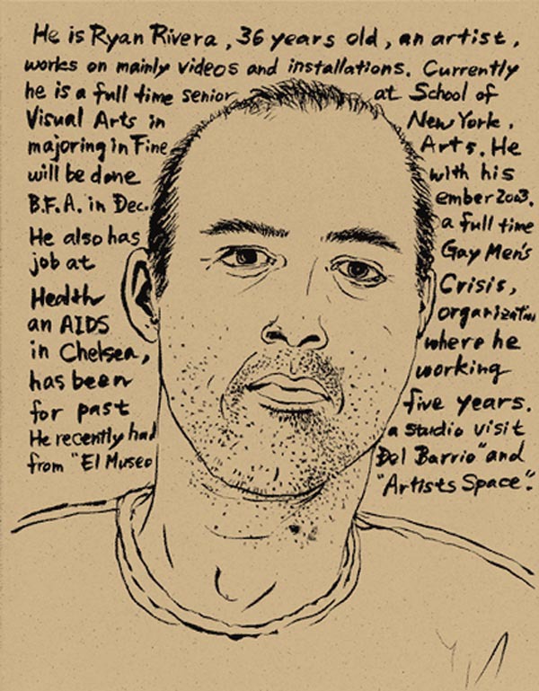
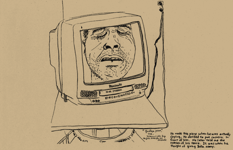
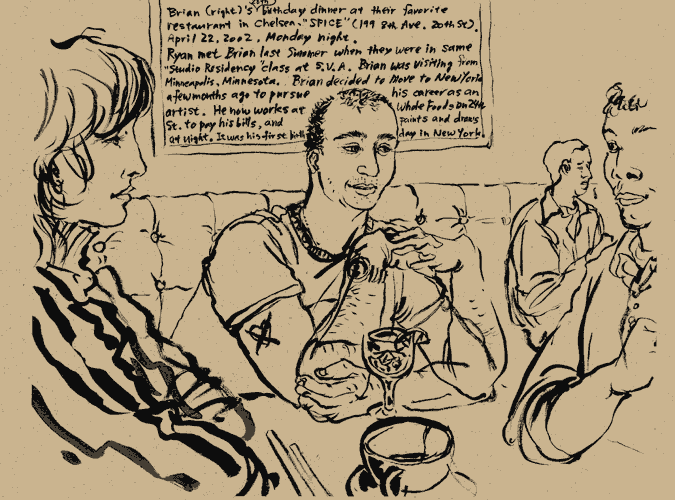
Last evening I learned that my really good friend Ryan has passed away.I first met Ryan during Fine Art Studio Residency Program at School of Visual Arts in summer of 2001. We got along immediately. Although in recent years we were not spending as much time, as we both have been busy with our lives after school, but I still consider him as one of my very closest friends.

Last time I saw him was about a year ago in his new apartment doing potluck lunch party with Studio Residency alum. Ryan loved my  Guacamole  so much I gave him the recipe. He later that week called me and said he was eating the Guacamole all that week.

It is hard to digest this unexpected sudden news. All his close friends, including myself, are more confused than feeling sad. I spent most of last night half awake half asleep recalling all the fun memories we had together.

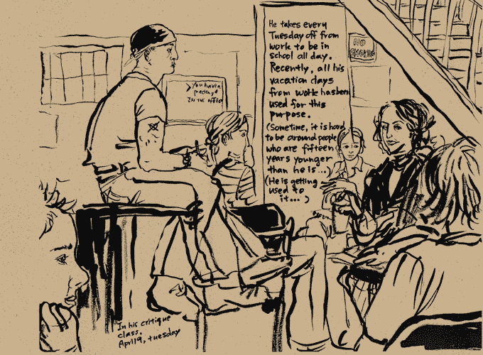
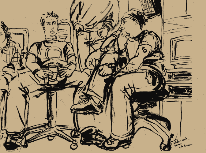
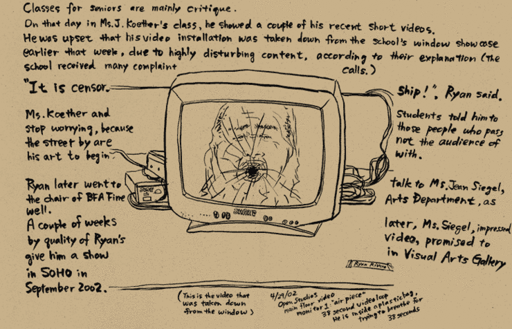
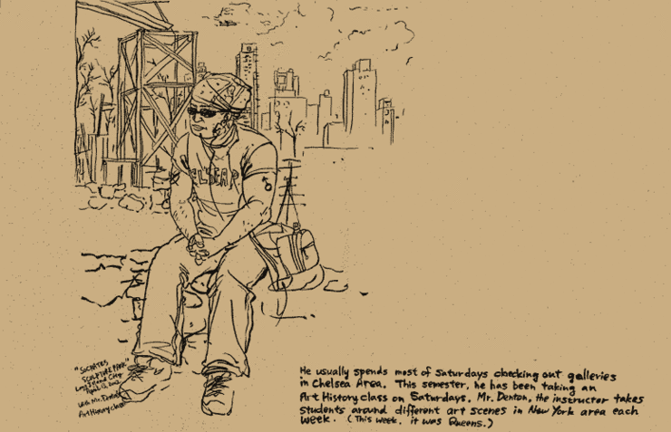
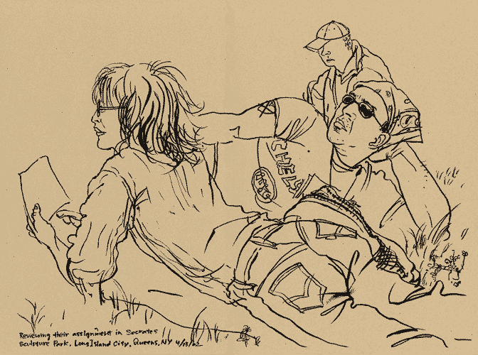
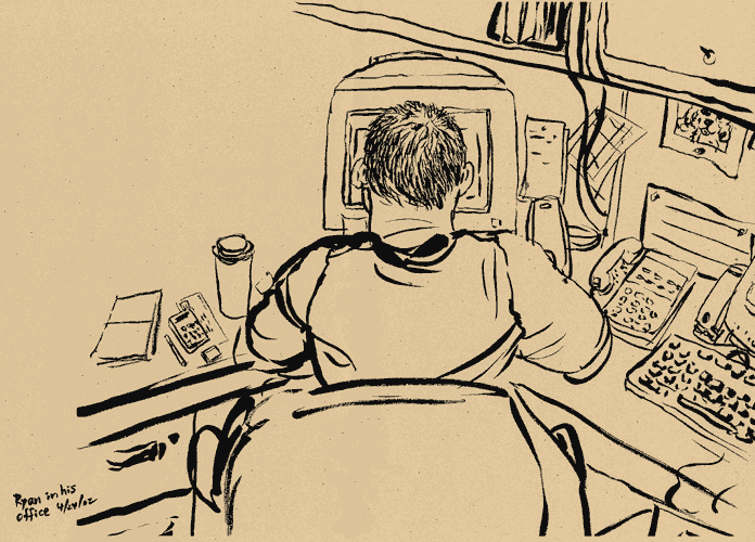
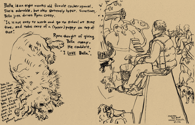
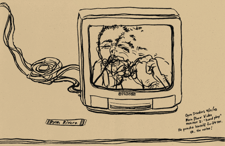
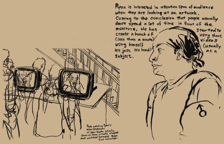
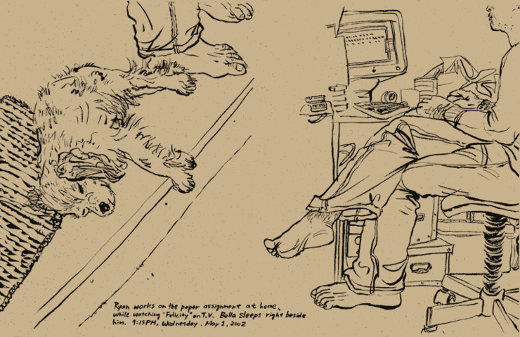
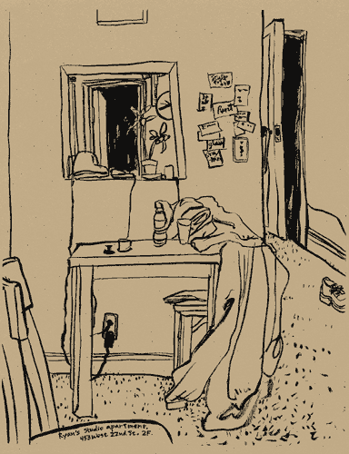
When we were still in school, I made a sketchbook documentary of his life. I decided dig up the pages and post here.

I know almost nobody who are reading this know Ryan, but his short precious life was worth knowing even if you didn’t know him personally.

Ryan Rivera: Story 1
Ryan Rivera: Story 2
Ryan Rivera: Story 3
Ryan Rivera: Story 4
Ryan Rivera: Story 5
Ryan Rivera: Story 6
Ryan Rivera: Story 7
Ryan Rivera: Story 8
Ryan Rivera: Story 9
Ryan Rivera: Story 10
Ryan Rivera: Story 11
Ryan Rivera: Story 12
Ryan Rivera: Story 13

Blow Up Opens

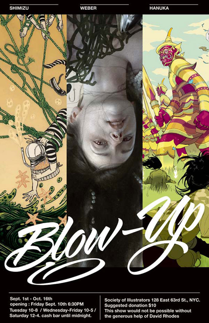
Blow Up, a show of works by Tomer Hanuka, Sam Weber and myself, opened today at the Society of Illustrators (NYC). Opening reception will be held on September 10th, next Friday.

Our concept was to create an exhibit of three ‘illustrators’, to show the power of print, and wanted to share what kind of creative and thinking process go into creating the works.

After a lot of ditched concepts and ideas, multiple meetings (over dinners and lunches), and needless to say, many many hours spent in front of our drawing tables, we are quite happy with the result, but then again, we have to let you the viewers decide themselves. It may not be a typical group show you may have been expected to see, so we are excited and nervous at the same time…

It would be great if you could visit, either at the opening party next week, or while the show is open.

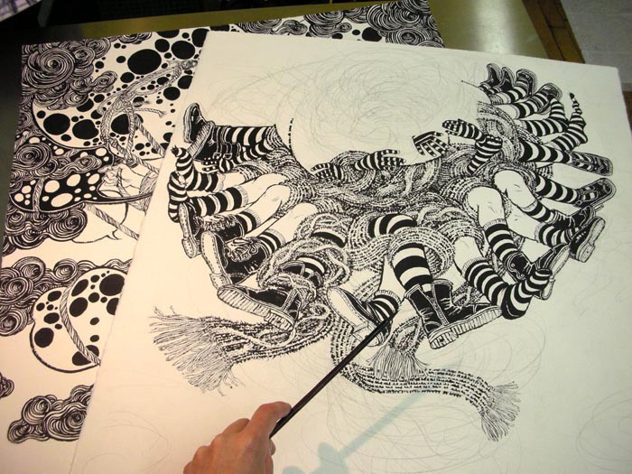
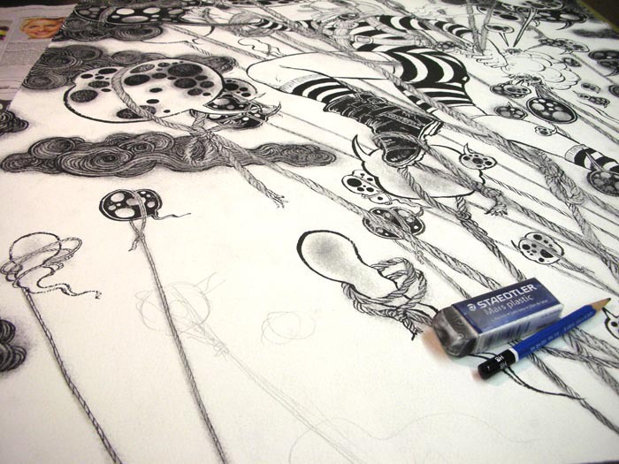
We each created series of new images for the show that were not shown previously, and I am sharing some of my final pieces here. Mine were created using the definition of term ‘blow up’.

Blow Up (September 2010): Illustration 3
Blow Up No.3: The Big Bang (original drawing: 22″x 30″)
Blow Up (September 2010): Illustration 2
Blow Up No.2: Storm Forming (original drawing: 22″x 30″)
Blow Up (September 2010): Illustration 1
Blow Up No.1: The Bubble (original drawing: 22″x 30″)
Blow Up (September 2010): Drawing Table 1
Blow Up (September 2010): Drawing Table 2
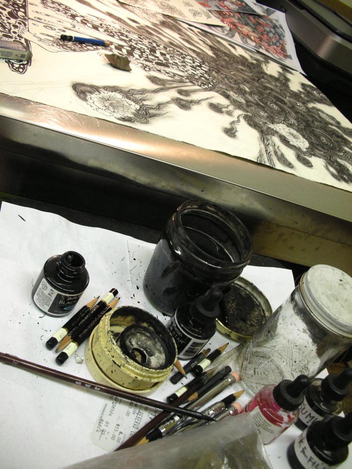
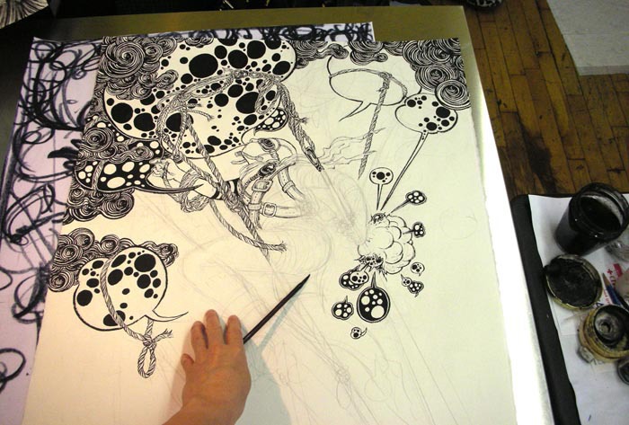
Mess on my drawing table…
Blow Up (September 2010): Drawing Table 3
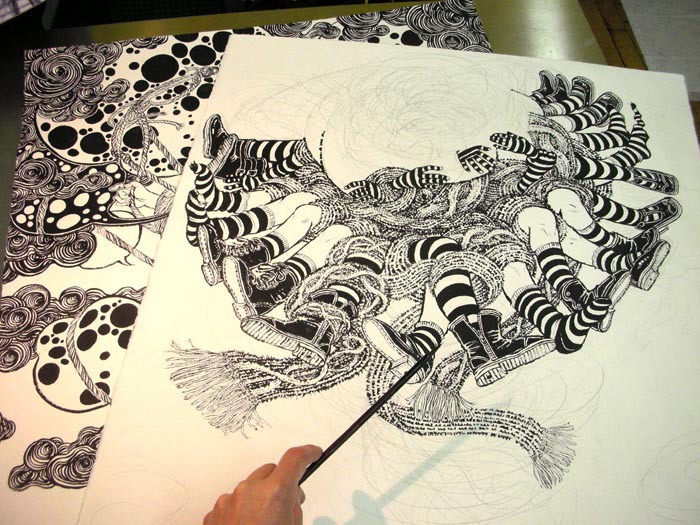
Long long hours of drawing….
Blow Up (September 2010): Drawing Table 4
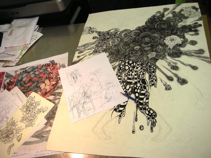
In my personal pieces, I figure the composition out as I go. So some parts are completely finished while some are still in rough pencil stage.I am not posting any photos of the final gallery spaces, because we want that to be a surprise when you come to the gallery. (I may post some photos after the opening party is over). But here are some pictures of work in progress last week.
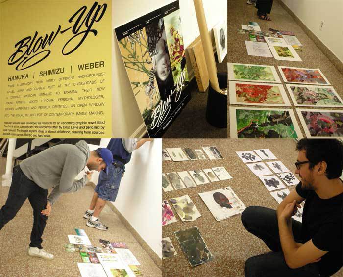
Blow Up (September 2010): Event
On the top row from left: entrance area, invite flyer, and Tomer’s works n the floor. on the bottom row: Tomer Hanuka on the left, Sam Weber on the right.I just got this gorgeously eerie piece from Tomer!
Blow Up (September 2010): Tomer's Illustration
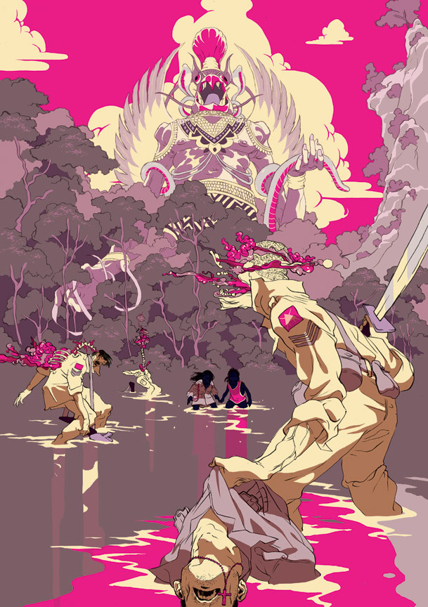
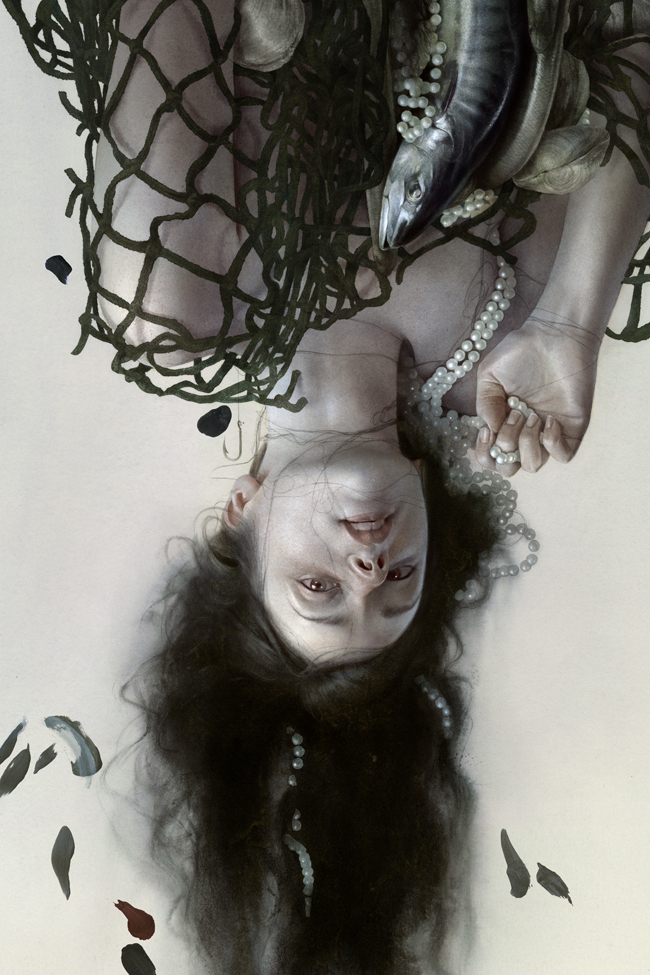
… and here is from Sam!
Blow Up (September 2010): Sam's Illustration
Thank you Anelle, Tim and everyone else at the Society of Illustrators for this opportunity. And last but not least, thank you Mr. David Rhodes for generous support in helping to make this show possible.

Blow Up

Society Of Illustrators - Blowup (September 2010): Cover

This kick-ass flyer created by Attack at Wieden Kennedy NYIt is official.Tomer Hanuka, Sam Weberand I will be in a three person show at the Society of Illustrators in September.We will be SO so happy if you could be able to make it.

It felt like it was never going to work out at first. Now, images are in hands of a great printer, new works being created, funding in order, and we are close to ready to hang the show toward the end of the month.

We want to thank Mr. David Rhodes for his generosity without which this may not have happened. Big thanks to Attack guys at Wieden + Kennedy who created this kick ass flyer for us. And, everyone at the Society of Illustrators and Tim O’Brien for giving us opportunity and being patient with us all along the way.

Hope to see you on September 10th.

Society Of Illustrators - Blowup (September 2010): New Works 1
Society Of Illustrators - Blowup (September 2010): New Works 2

I am working on a few new works last minutes to match what Tomer and Sam have for the show. Working through this weekend!!