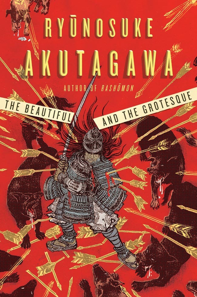
Congratulations again to everyone who’s work is exhibited at the Society of IllustratorsBook/Editorial Show, and nice seeing you (those who were there) at the opening party on Friday night. Missed the party? No worries, the exhibit is open to public through February 20th.I had realized I forgot to post the creative process of the cover for The Beautiful and Grotesque, a collection of short stories by Ryunosuke Akutagawa, one of the most celebrated modern Japanese authors. So, here it is.
AD: Albert Tang (W.W. Norton) and Rodrigo Corral (Rodrigo Corral Design).
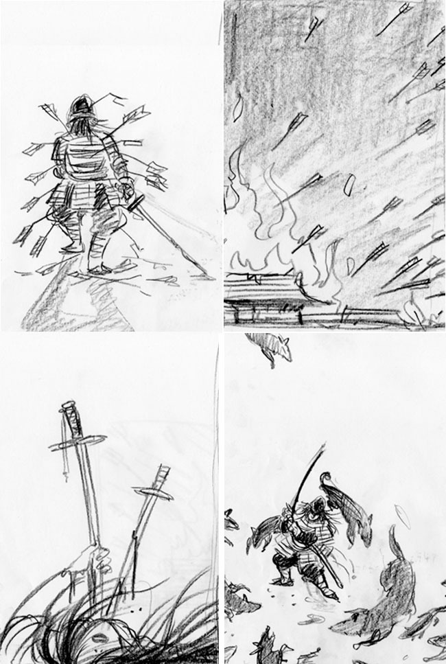
The process started from rough ideas. I gave them four different scenes from the longest story in the book: The Robbers. I think the only art direction I got is that it is an adult fiction and the cover should not look like a young adult book. I always repeated that in my head while working on ideas as well as coloring process.
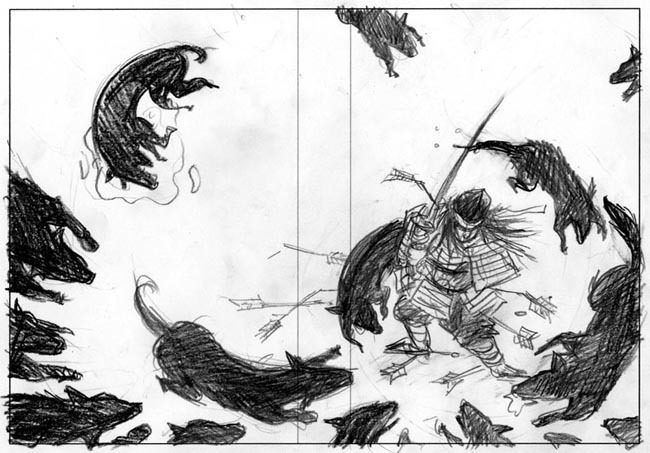
They picked one of them, and the next stage was to make the wrap around sketch for the cover.
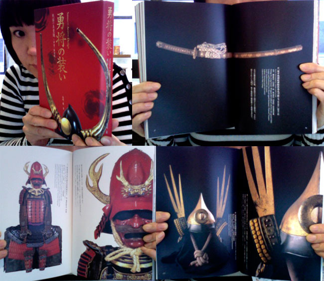
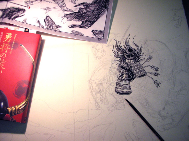
My secret weapon and amazing reference book for this project: “勇者の装い Samurai Armor Design” from PIE Books of Japan, bought at Kinokuniya Bookstore Bryant Park branch in New York. It is a wonderful coffee table book and makes a great gift too.
As you can see, sketch with gutter space is printed out to the size I would draw, and traced onto watercolor paper using light box. The rest is just tedious drawing process using ink and brush for hours till I am done.
Black and white drawing is done. Next step is coloring on Photoshop.
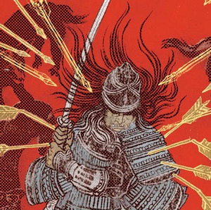
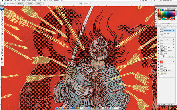
Screenshot of Photoshop process. As you can see, I ended up multiplying arrows to give image more depth and contemporary feel to the image.
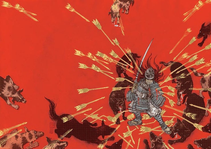
This is the final wrap around cover image.
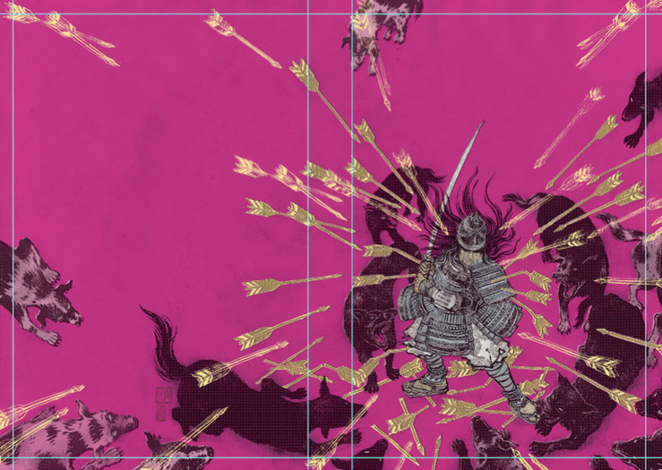
There were a few color variations to choose from. I actually liked this fuchsia version too. Intentionally chose the color that is not in traditional Japanese color scheme to give it contemporary feel.
Final front cover. I love this unexpectedly contemporary design. I am so happy they didn’t take the expected direction of making it look very Japanese. Design: Rodrigo Corral, AD: Albert Tang


