Yuko Shimazu Yuko Shimazu Yuko Shimizu

Award winning Japanese illustrator based in New York City and instructor at School of Visual Arts.

Do You Know Yunmee Kyong?

You don’t know Yunmee Kyong’s work? You are missing out a lot. But that’s no more.

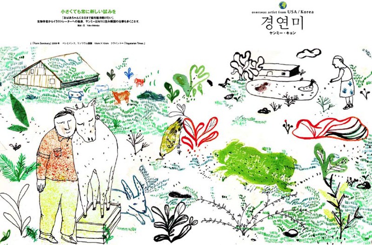
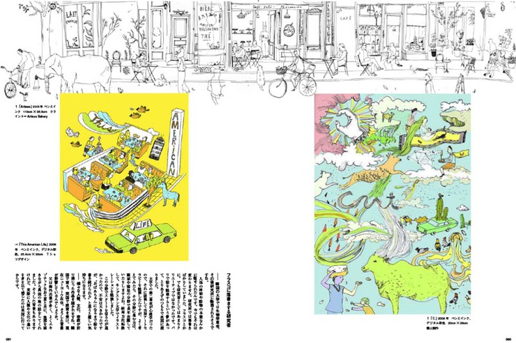
The latest on my illustartor interview article series for Japanese magazine Illustration features Yunmee and her whimsical and fantastic world. (layout are as follows)

If you don’t read Japanese, don’t worry, Illustration Friday has published the unabridged original interview in English.

Get inspired by this world citizen!

More of Yunmee’s work can be seen on her website.

Illustration Magazine (April 2010): Yunmee Kyong 1
Illustration Magazine (April 2010): Yunmee Kyong 2
Illustration Magazine (April 2010): Yunmee Kyong 3

One More Blizzard Before April

Outdoor Magazine (March 2010): Small Version
All of a sudden, it is SPRING! And I am loving it. I don’t mind cold weather, but having less light makes me feel blue. I am so welcoming the arrival of spring.But I love snow. And I love drawing snow scenes even more. When I graduated, I had tons of images in my portfolio that had something to do with snow, even till this day, I am ‘to call person’ when it comes to snowy images. (And I welcome that.)

There were illustrations I had created for Outdoor Life that I have been meaning to post here. Before the calendar changes to April, I have to post this last blizzard image of the season.

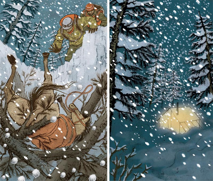
The story was about elk hunters gotten stuck in blizzard, a page-turner survival story. Illustrations I created are for double page spread opener and two interior spots. Needless to say, I had so much fun. I felt like I was one of the guys who got stuck in the mountains!

Big thanks to Art Director Jim Walsh of Outodoor Life for this fun project.

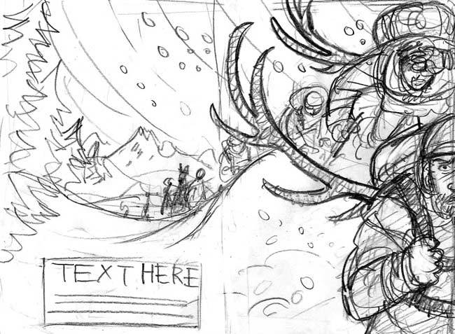
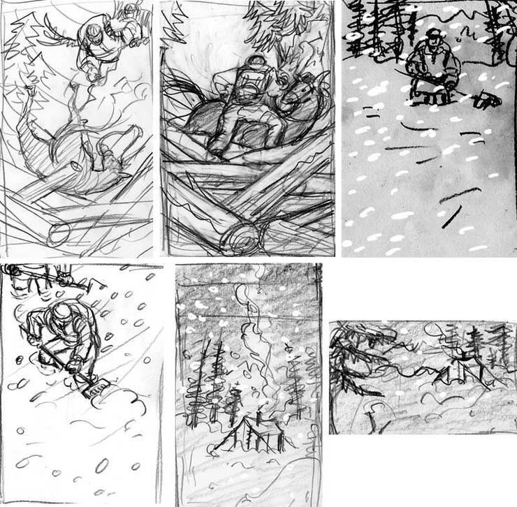
Outdoor Magazine (March 2010): Submitted Idea 1
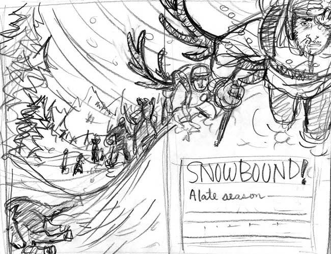
Outdoor Magazine (March 2010): Submitted Idea 2
Two separate compositions were submitted. I was excited about guys having antlers in their backpack, but unfortunately that idea got killed because the group with horses won’t carry them on their back. Ah, too bad!
Outdoor Magazine (March 2010): References
Some of the reference materials downloaded from internet. Rather than copying positions or compositions, they were for me to learn what elk hungers look, how they carry their stuff, etc
Outdoor Magazine (March 2010): Sketches
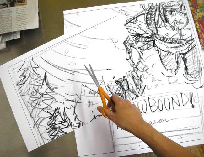
People often ask me how I transfer my sketches onto drawing papers. I simply blow up the sketches to the size I want to draw (tape them together) and light-box it onto watercolor papers that are cut into the size.
Outdoor Magazine (March 2010): Drawing Table
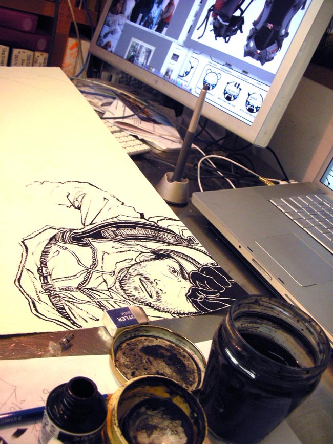
I do have a drawing table on the side of the computer table, but this image needed a lot of references, therefore, I ended up spreading this 22″ x 30″ sheet of paper in front of my screen and scroll through references as I drew. Drawing is brush and ink on watercolor paper.
Outdoor Magazine (March 2010): Adobe Photoshop
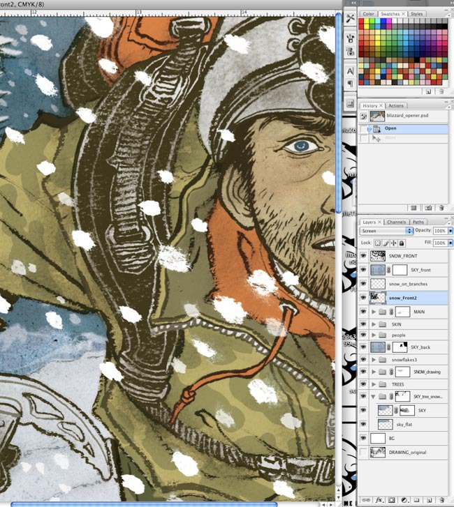
Screen shot of Photoshop coloring stage. Snow was added as separate drawings. Opacity and size of snowflakes are manipulated to add depth to the space.
Outdoor Magazine (March 2010): Final Illustration
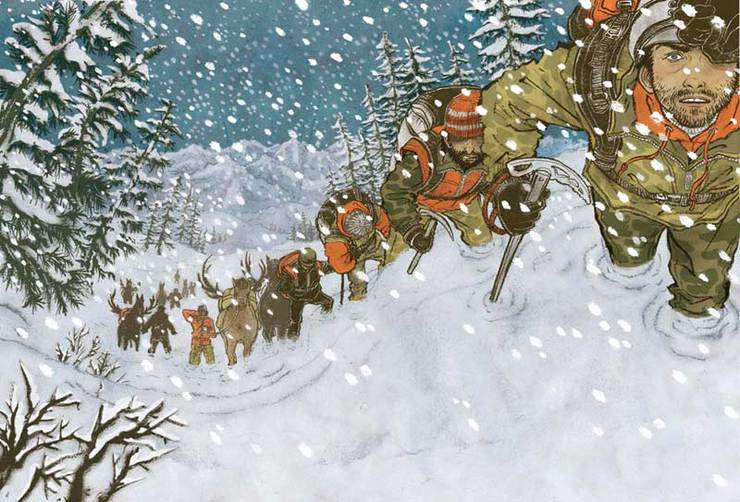
Final illustration! the right bottom space is for the type. I forgot to buy this issue, so I should ask the ADs for the layout so I can post that too.
Outdoor Magazine (March 2010): Watercolor Sketches
Sketches for the spots
Outdoor Magazine (March 2010): Glowing Tent
Spot illustrations were rather simple, but fun. I am liking the final result of glowing tent image.

FIT Lecture Tomorrow

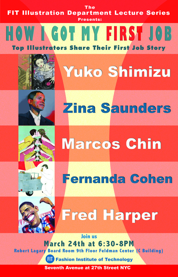
How I Got My First Job, a lecture at Fashion Institute of Technology (FIT) will be held tomorrow evening, March 24th.

I will be a part of it together will fellow Drawgers: Marcos Chin, Fernanda Cohen and Zina Saunders, along with Fred Harper.

The lecture will be open to public.

Fashon Institute of Technology: 7th Avenue at 27th St, New York City Robert Lagary Board Room 9th floor (C Building)

March 24th (Wed) at 6:30PM

Hope to see you there!

FIT: How I Got My First Job

33 Album Covers

The Society of Illustrators annual show of advertising and institutional category just opened last week here in New York (runs up to March 20).

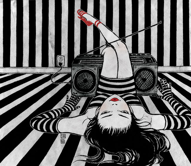
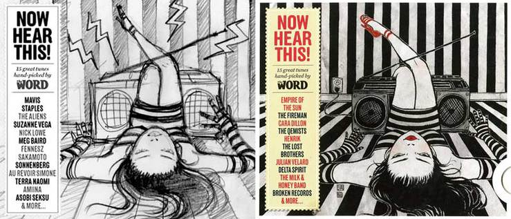
I have two pieces in the show, both of which were album covers created for a British music magazine The Word. They have supplement CD filled with new music every month.

To have two of my favorite covers out of 33 covers I created monthly, was a good finale for the project. The project that started close to three years ago, recently ended with the magazine redesign as of February issue of this year.

This monthly gig came during their last redesign. Matthew Ball, a Scottish freelance art director and former Rolling Stone AD who I used to work with often, kindly pulled me into this project. What I thought would only last for a short period, ended up as accumulation of 33 images. I think I got some good pieces out of them which lead to some other jobs and projects.

The Word Magazine (March 2010): Now Hear This! - Illustration 1
The Word Magazine (March 2010): Now Hear This! - Illustration 2
Above are two images accepted into The Society of Illustrators advertising and institutional show. They were both created for The Word magazine supplement CD Now Hear This!Readership of the magazine is mainly young men, so the only art direction they gave me was to have “sexy girl with music instruments”. I had a lot of fun with this lighthearted project every month. I think I did pretty much every variation I think of in the theme within that 32 covers. Things do end when they need to end.  It was time for a change.

In this occasion, I decided to post some of the covers I was happy with. You can also see cover image archive here.

Big thank you to Matthew Ball, editor Mark Ellen, AD Jonathan Sellers, production editor Mike Johnson, and last but not least Jerry Parkins who made sure my payments don’t get delayed every month.

The new The Word looks really good with illustrated covers by André Carrilho. Take a look when you are at (international) newsstands.

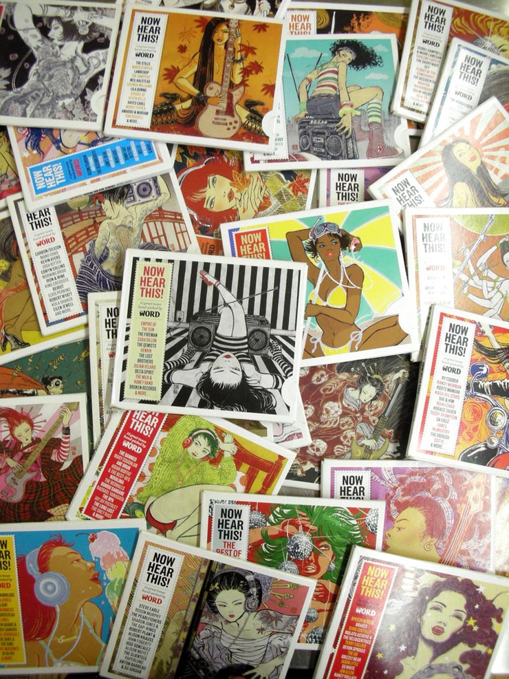
The Word Magazine (March 2010): Now Hear This! - Collection 1
I decided to put all the past covers out and take a photo. Wow, I made so many in less than three years…
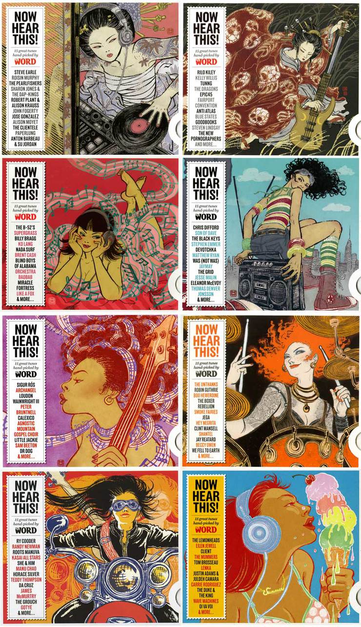
The Word Magazine (March 2010): Now Hear This! - Collection 2
Above are some of my favorite covers. Many of them ended up reused in different projects later.
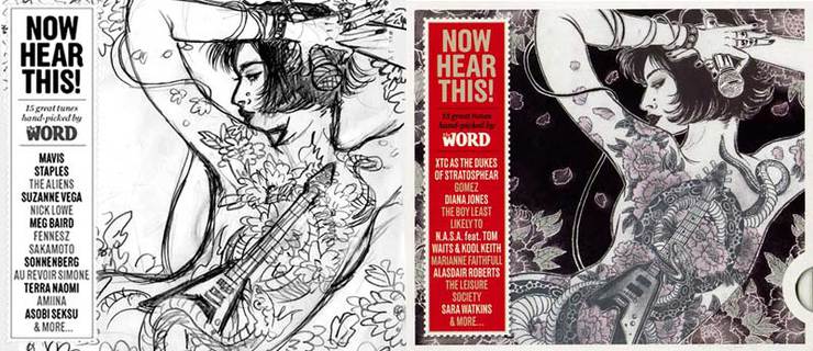
The Word Magazine (March 2010): Now Hear This! - Spread 1
The Word Magazine (March 2010): Now Hear This! - Spread 2
We were so used to working together, most of the month, our process got very simple: one sketch, one final. This, of course, does not happen often with other clients.

1/100 (Belated) Head For Haiti

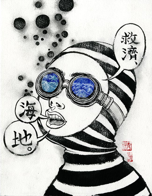
Many of fellow Drawgers have posted their head drawings/paintings already. My belated contribution… black/blue/green ink and red seal on watercolor paper.

100 Heads for Haiti is a group show organized by Dave Plunkert and Spur Design. Each head, done by various illustrators, will be sold for just $100 each for charity purpose to raise money for Doctors without Borders.

Show opening Saturday, April 12th at SPUR Gallery, Baltimore, MD.

100 Heads For Haiti
Please buy my head and help Doctors Without Borders (a charity I never forget to donate to every year)I have moved to New York form Tokyo 11 years ago. The first apartment I found was on Upper East Side with a Haitian roommate. We only lived together for three months, but we became a long time friends since. She has cooked me Haitian dishes, taught me how to prepare Haitian mint tea, and told me about her family.I have never been to Haiti, but I feel close to the country because of her.

To create this image, I researched the word Haiti in Chinese. It is written as “海地”. 海 means ocean and 地 means land. What a beautiful name. So I drew in her diving glasses one side ocean and one side land.

100 Heads For Haiti: Small Version
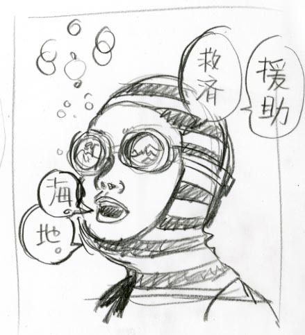
Pencil rough sketch

Pink Slip

More Magazine (March 2010): Small Version
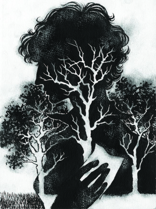
Great Recession continues. And, every one of us know at least a few close people in our lives who have lost their jobs because of this current economic situation.This illustration was done for March issue of MORE, a magazine for grown up women with career and family, about this exact topic.

The story is titled: ‘Fired at 50′. It focuses on the emotional struggle of women who have lost their long term jobs. It felt so ‘real’ to me.

March happens to be a transitional month when winter slowly turns into spring. So I decided to use season as metapher of women’s emotional struggle.

Claudia Almeida was the Art director.

This has been a long cold winter with a lot of snow for North-Easterners, but we all know spring is right around the corner!

More Magazine (March 2010): Ideas
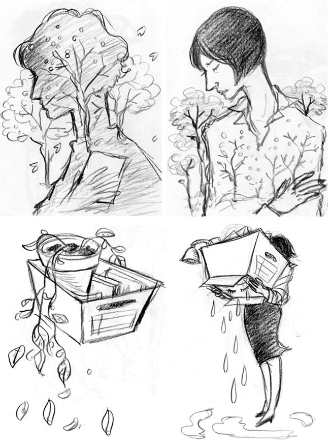
Four ideas were submitted.
More Magazine (March 2010): Watercolor Version
Black and white drawing, ink on watercolor paper.
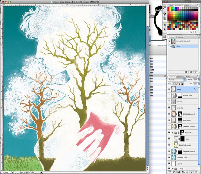
More Magazine (March 2010): Adobe Photoshop
Coloring on Photoshop. Reversing the dark and light was not my initial plan but along the way, I found this solution worked the best. When a new trial works, it is always a nice feeling.
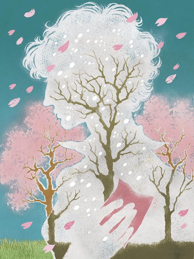
More Magazine (March 2010): Final Illustration
Final illustration. Snowflakes and cherry petals were separate drawings added as layers on Photoshop. Published in MORE Magazine March issue.

Waiting For Spring

Plan Sponsor Magazine (February 2010): Small Version
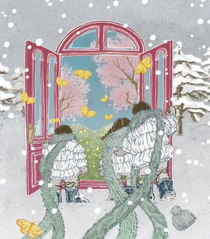
Why is snow so pretty when it is falling, but becomes a huge mess right after? Winter feels a lot severe this year, doesn’t it?When trees start to get light green new leaves, and flowers start blooming everywhere, that is my favorite season. I have been dreaming about Spring ever since this long winter started.

When SooJin Buzelli called me for PLANSPONSOR cover with the theme of “the worst is over”, this was the idea which came to my mind immediately: my longing for spring…

Process post of this image felt perfectly appropriate today when you cannot walk outside New York City without a good pair of rubber boots.

Plan Sponsor Magazine (February 2010): Ideas
Three ideas submitted. I would have been happy to do the other two as well. I really like drawing plants (and suitcases).
Plan Sponsor Magazine (February 2010): Inspirations
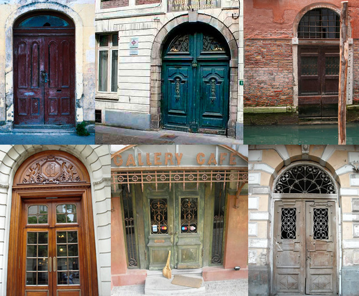
These are my inspirations. bunch of shabby-chic door photos downloaded from internet. Although, I rarely use one specific photo as reference, so the final result was mix and match of them all.
Plan Sponsor Magazine (February 2010): Watercolor Version
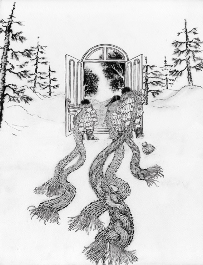
Original b/w drawing on watercolor paper. I normally finish everything on the drawing stage, but this one is very much half-done. Soft snow does not need harsh outlines.
Plan Sponsor Magazine (February 2010): Final Illustration
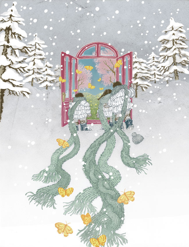
Final illustration. As you can compare with the original drawing, all the snow is added directly on Photoshop stage. Butterflies were drawn separately as well.
Plan Sponsor Magazine (February 2010): Adobe Photoshop
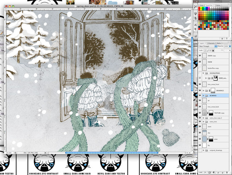
Photoshop progress stage. This illustration had so many layers, I have a lot of folders, and there are some more folders inside folders to have everything organized and so that I can keep track of everything.
Plan Sponsor Magazine (February 2010): Close Up Of Trees
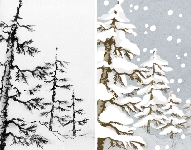
Close-up of the trees in original drawing and in final Photoshop file. separate layers of gray-white were added to add depth to snow, and outlines were softened. I even added one more tree behind the third one on the right to give idea of space.
Plan Sponsor Magazine (February 2010): Cover
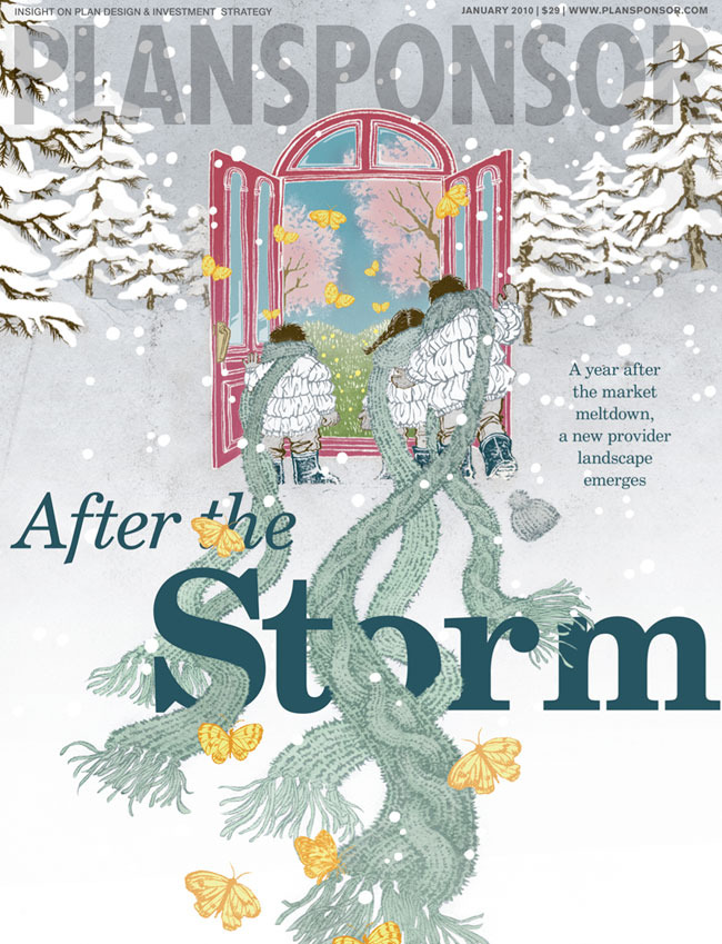
Final cover. Creative Director: SooJin Buzelli. Loving the type treatment woven into the scarves.By the way, I do draw snow scenes a lot. This goes back to when I was in graduate school and I was getting good at drawing figures but terrible at putting them in environment.

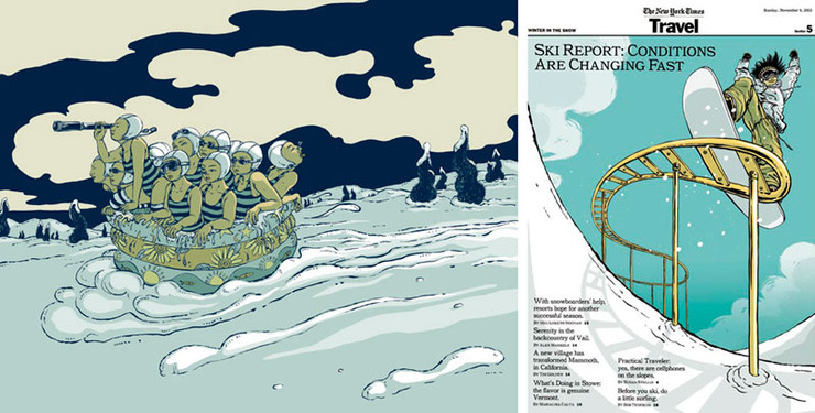
Thomas Woodruff, my thesis adviser, gave me an assignment to put people interacting in some kind of environment. I got panic, and drew this (left). It made me realize that drawing snow scene was: 1. Easy  2. Fun. I ended up drawing a whole bunch.

Now, I am proud to say I can put people in any environment. So, thank you Tom.

And this first snow trial eventually got me a gig to do the New York Times Travel Section (AD: Barbara Richer) cover (right), my first big job.

Well, I should probably love snow.

NY Times Travel Section (February 2010)
My first environment (=snow) attempt when I was in graduate school (left). And memorable first ‘big’ gig that brought me (right).

Samurai Process

The Beautiful And The Grotesque: Small Version
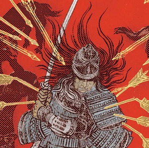
Congratulations again to everyone who’s work is exhibited at the Society of IllustratorsBook/Editorial Show, and nice seeing you (those who were there) at the opening party on Friday night. Missed the party? No worries, the exhibit is open to public through February 20th.I had realized I forgot to post the creative process of the cover for The Beautiful and Grotesque, a collection of short stories by Ryunosuke Akutagawa, one of the most celebrated modern Japanese authors. So, here it is.

AD: Albert Tang (W.W. Norton) and Rodrigo Corral (Rodrigo Corral Design).
The book will be published from W.W. Norton this year.
The Beautiful And The Grotesque: Sketches
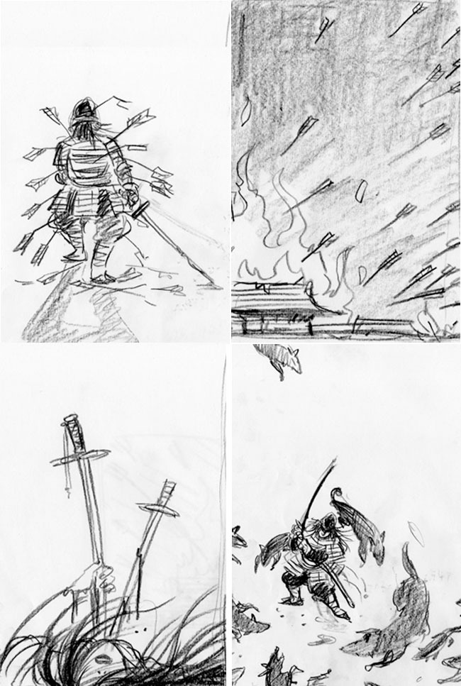
The process started from rough ideas. I gave them four different scenes from the longest story in the book: The Robbers. I think the only art direction I got is that it is an adult fiction and the cover should not look like a young adult book. I always repeated that in my head while working on ideas as well as coloring process.
The Beautiful And The Grotesque: Wrap Around Cover, Black & White Version
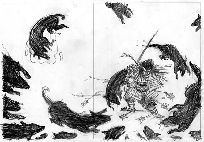
They picked one of them, and the next stage was to make the wrap around sketch for the cover.
The Beautiful And The Grotesque: Samurai Armor Design
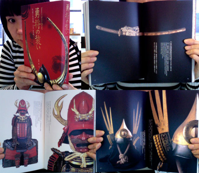
My secret weapon and amazing reference book for this project: “勇者の装い Samurai Armor Design” from PIE Books of Japan, bought at Kinokuniya Bookstore Bryant Park branch in New York. It is a wonderful coffee table book and makes a great gift too.
The Beautiful And The Grotesque: Watercolor Version
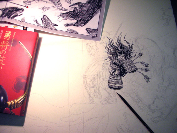
As you can see, sketch with gutter space is printed out to the size I would draw, and traced onto watercolor paper using light box. The rest is just tedious drawing process using ink and brush for hours till I am done.
The Beautiful And The Grotesque: Wrap Around Cover, Black & White Version
Black and white drawing is done. Next step is coloring on Photoshop.
The Beautiful And The Grotesque: Adobe Photoshop
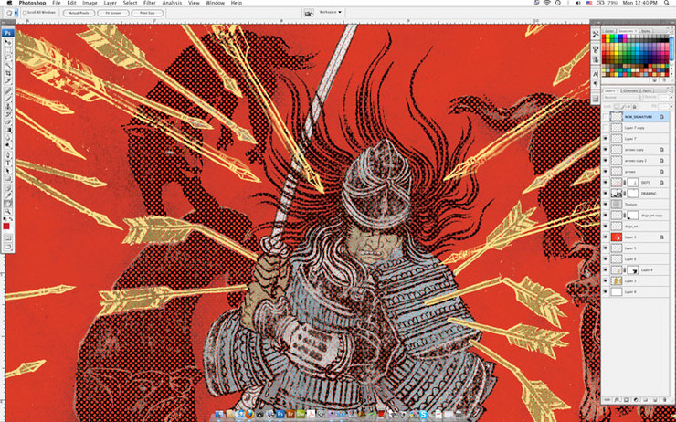
Screenshot of Photoshop process. As you can see, I ended up multiplying arrows to give image more depth and contemporary feel to the image.
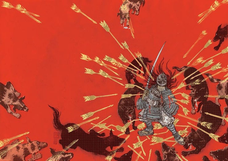
The Beautiful And The Grotesque: Wrap Around Cover, Colored Version
This is the final wrap around cover image.
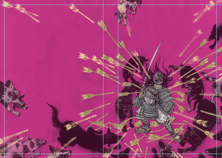
The Beautiful And The Grotesque: Fuchsia Color Version
There were a few color variations to choose from. I actually liked this fuchsia version too. Intentionally chose the color that is not in traditional Japanese color scheme to give it contemporary feel.
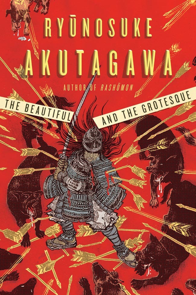
The Beautiful And The Grotesque: Cover
Final front cover. I love this unexpectedly contemporary design. I am so happy they didn’t take the expected direction of making it look very Japanese. Design: Rodrigo Corral, AD: Albert Tang

We Will Rock You

ESPN Magazine (February 2010): We Will Rock You - Small Version
I don’t like to regret. So I try not to dwell over things that didn’t work out in past. But there is one incident I cannot get over after many many years: missed a Queenconcert, with, yes, a backstage pass.I grew up with an older sister so when I was in elementary school I was already familiar with such Queen albums as A Night At The Opera and Sheer Heart Attack. Yes, long before the famous News of the World album became the super-mega-hit.

Somehow, my social savvy sister got backstage pass to Queen concert in the 80s and invited me to come with her. I don’t know why I didn’t. I probably was too young and maybe midterm exam was more on my mind than Queen. Stupid me.

My sister came back with tons of photos of Freddie and Roger and rest of the band members eating yakitori in a small restaurant during the after party. 
And that was the last tour Queen had in Tokyo before Freddie Mercury passed away shortly after.

Illustrators all have our ‘dream job list’. In the beginning, we get excited crossing one out at a time. After a while we realize it is OK not to cross everything out and eventually forget about the list. But once in a while, out of the blue things on the list come back and surprise us with excitement.  Needless to say Freddie Mercury was on the top of my list, but I thought the day would never come because it has been so long since he has left this world.

Siung Tjia, Creative Director of ESPN The Magazine, is a friend, but most of the time we talk about Chinese movies we love and Korean food we want to try for next lunch, so I assume he had no idea about my dream job list when he called me.  Well, thank you Siungl! This was such a treat and a PERFECT assignment. And designer was Lou Vega.

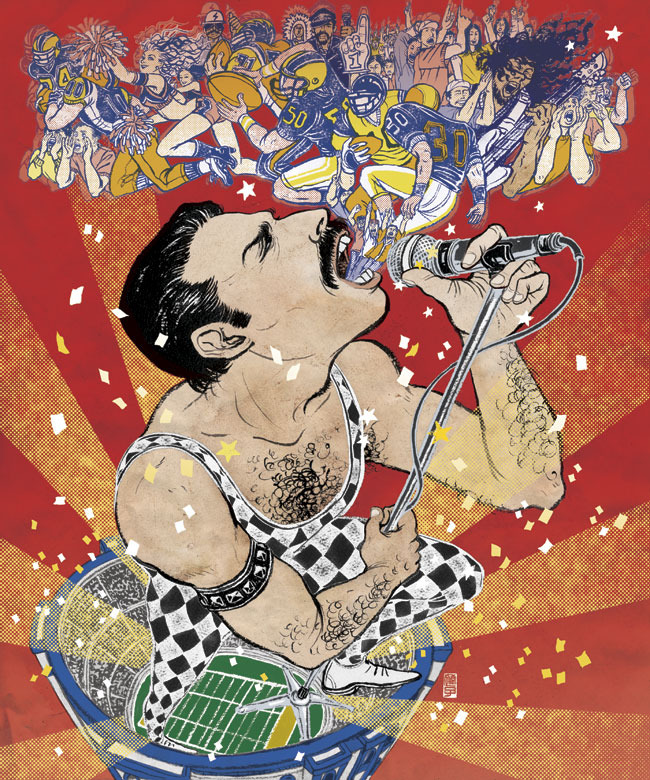
The story was about America’s No.1 Stadium Anthem. Of course, it was Queen’s We Will Rock You written by Brian May The article (and illustration) is in the latest issue of ESPN on newsstand now.

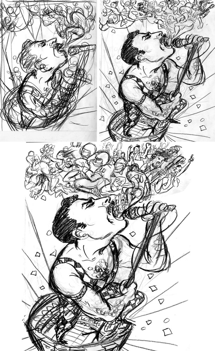
ESPN Magazine (February 2010): We Will Rock You - Sketches
Rough layout first, then to a sketch, then to revised sketch with larger crowd and prominent stadium.
ESPN Magazine (February 2010): We Will Rock You - Freddie Mercury Live 1
For me, Freddie is all about THIS costume. It was long before We Will Rock You, but I had to put him in this outfit. This shocked me when I was about 10 years old…
ESPN Magazine (February 2010): We Will Rock You - Freddie Mercury Live 2
Gathered a lot more reference of Freddie (when he was older). I noticed he holds the microphone in a specific way, so I mimicked that in the final illustration.
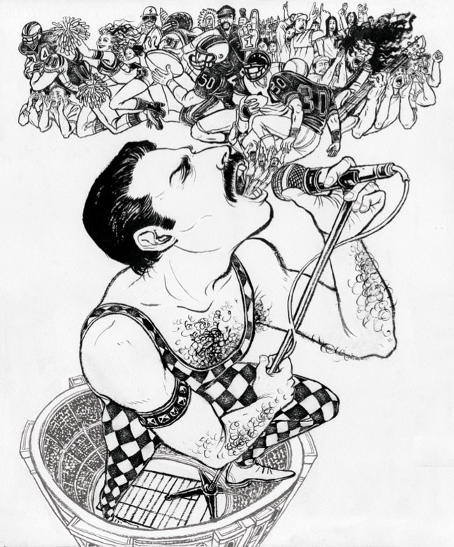
ESPN Magazine (February 2010): We Will Rock You - Watercolor Version
Black and white drawing before Photoshop stage. Black india ink on watercolor paper. Original size about 18.25″ x 22″
ESPN Magazine (February 2010): We Will Rock You - Final Illustration
Final image. I worked extra hard on this (not that I don’t work hard on other ones). Ah, flash-back of the missed last concert and Freddie in yakitori restaurant photos while working on this….
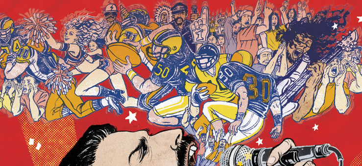
ESPN Magazine (February 2010): We Will Rock You - Crowd Details
Details of the crowd. Metallica and Village People also made the list.
ESPN Magazine (February 2010): We Will Rock You
Final layout. Siung Tjia CD, Lou Vega AD/design. ESPN The Magazine Fan Issue is out now.