Yuko Shimazu Yuko Shimazu Yuko Shimizu

Award winning Japanese illustrator based in New York City and instructor at School of Visual Arts.

My First Blackmail

Yes, I wrote my very first blackmail. No. Of course not for real! I’m not that kind of a girl.

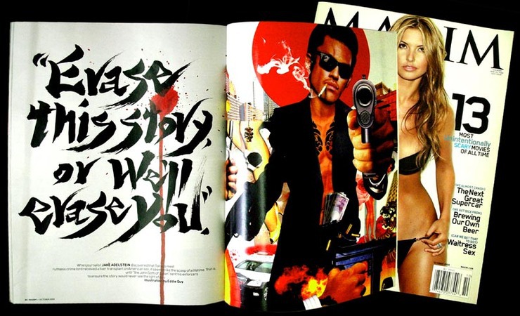
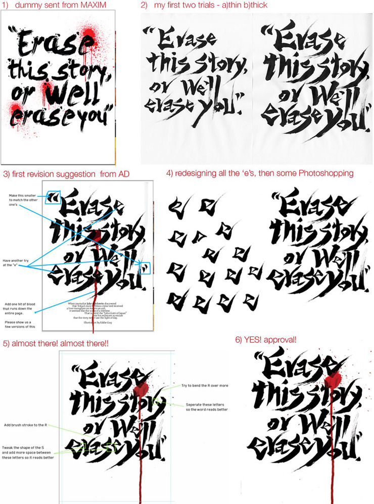
Sean Johnston of MAXIM Magazine called me for an unusual project. Not illustration. It was already assigned to cool and talented Mr. Eddie Guy. My job here was to fill the opposite page of that illustration. Yes, to design the title page.

The story was about Japanese Yakuza. MAXIM wanted something that looked cool, noir, Japanese, and blackmail-y.

Maxim Magazine (October 2009): Spread
MAXIM November issue. My blackmail next to Eddie Guy’s illustration.To be honest, I got a bit nervous when I got the first call.  My close friends know that my secret fantasy is to become a kick ass designer and work at PentaXXXX with my hero PauXX ScXXX. But I honestly don’t know anything about typography. I think I can draw pretty much anything with a brush by now working as an illustrator for years. But hand-written type? Ummm.

But then, why am I an artist if I don’t get to experiment. So, I said: “yes. I. can.”

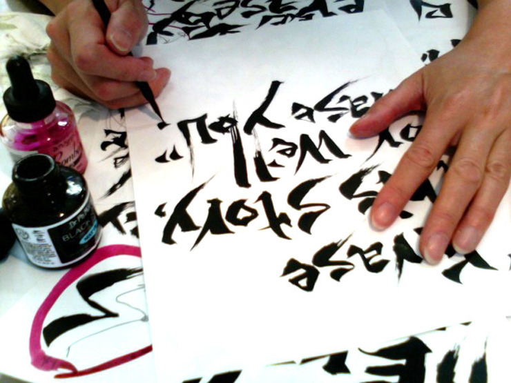
Maxim Magazine (October 2009): Sketch 1
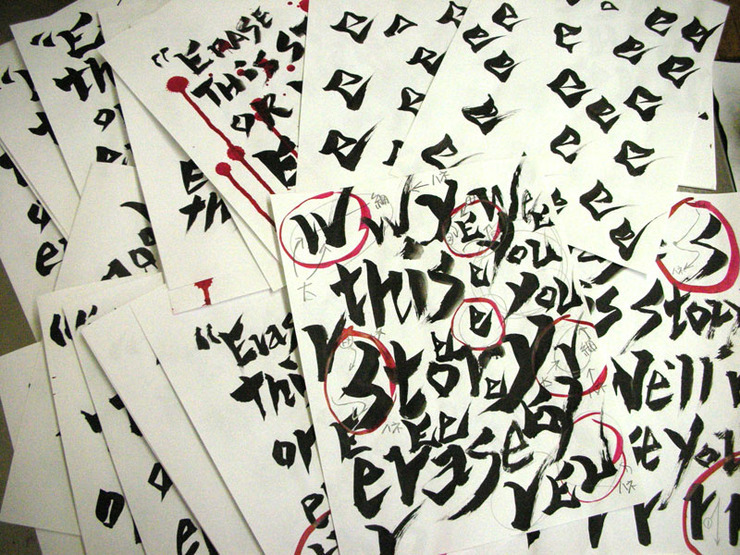
The difference between illustration and calligraphy is that in illustration you work on one image for a long time in calligraphy you work quickly but may have to do as many till you get ‘the one’. (i.e.: same amount of time.)Soon, the drawing table was completely covered by a mountain of all the failed trials. And a corner of my studio became a make-shift fake-blood-factory. Hours and hours and days of working into it…, yes, I did it! And I am quite proud of my first blackmail.

Maxim Magazine (October 2009): Sketch 2
I don’t know how many I wrote… piles and piles of paper on my drawing table.
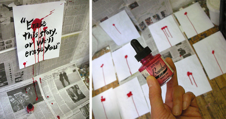
Maxim Magazine (October 2009): Bombay Red Ink
I made blood on a corner of my studio. Bombay Red ink makes good blood, in case you need to know.
Maxim Magazine (October 2009): Storyboard
Here is the quick start-to-finish process. My dad would cry if he knew I used Photoshop to make revisions, but it is all about good design, so it is OK, OK. (In Japanese calligraphy, it is a biggest no no to make any revision on the finished piece.)Big thank you to MAXIM Magazine, Dirk, Sean, Chandra and Billy, who have been supportive of my work over the years at various different magazines.

This Week In San Francisco

San Francisco (October 2009): Poster
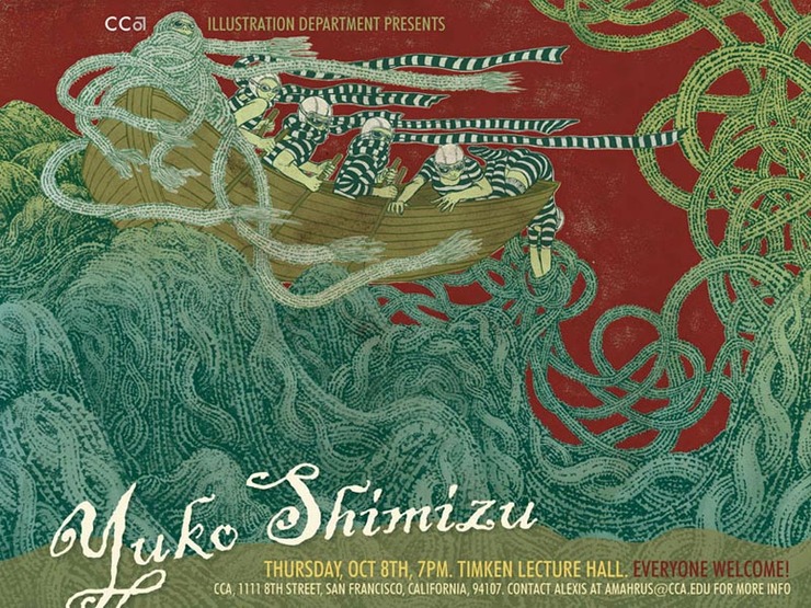
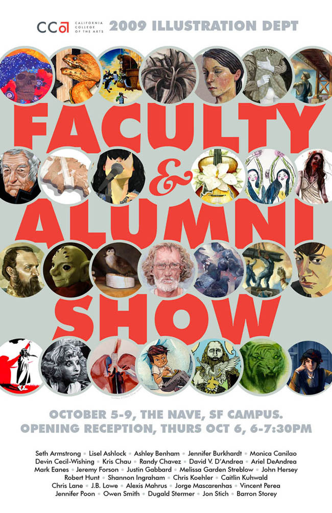
California College of the Arts (CCA)kindly invited me to speak at their campus this coming Thursday.  I am taking ta cross-continental flight to one of my favorite cities in the US, San Francisco.Lecture is open to public, so if any of you out in San Francisco area is interested, please come stop by. They have a faculty and alumni illustration show on the same evening, which looks like an interesting show to check out.Thank you Bob Ciano, Robert Hunt and everybody else at CCA. Looking forward to be there.

San Francisco (October 2009): Faculty Alumni Show

Mundane Objects

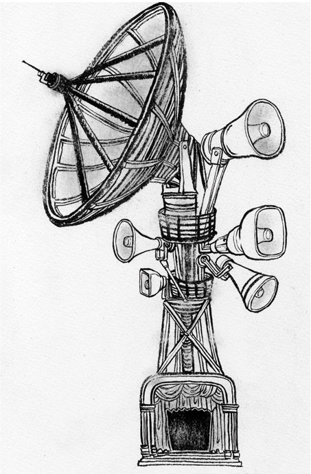
Fast Company Magazine (October 2009): Satellite, Small Version
‘How do professional illustrators come up with ideas?’ I often get asked by students and aspiring illustrators. A lot of them believe we have  especially developed brains that when we start thinking of ideas, light bulb just lights up, like one of those old-fashioned cartoon.Well, that is not true. How we come up with ideas is not so much different from how anyone else would come up with ideas: lots of research and lots of brain-storming. Simple as that.

Recent illustration I did for Fast Company Magazine (October issue) was a story about how to promote  a red-carpet event efficiently so more people know about it.

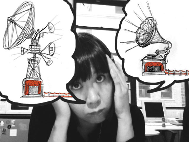
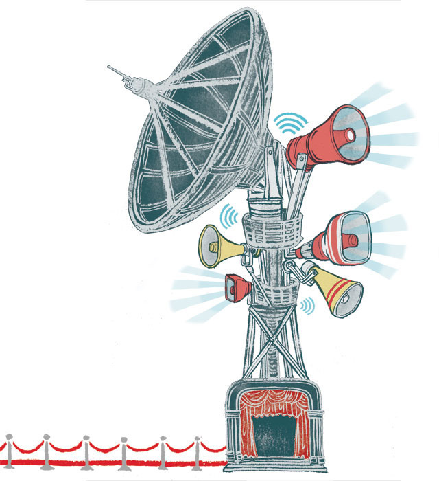
My solution?: research whole bunch of mundane yet ‘loud-speaking’ objects, put them together to come up with a bizarre theater machine that is screaming ‘promotion’. Sometimes, an idea can be as simple as that.

Fast Company Magazine (October 2009): Plan An Illustration, Step 1
First, think of anything that’s related to: 1) red carpet event 2) promote loudly.
Fast Company Magazine (October 2009): Plan An Illustration, Step 2
Then, put them together and think if you can come up with interesting enough visual.
Fast Company Magazine (October 2009): Satellite, Black & White Version
Voila! Now you have an illustration. The key to inventing a surrealistic object is that how the things are connected together somehow seems believable.
Fast Company Magazine (October 2009): Satellite, Colored Version
After the digital coloring. now this weird surreal PR machine is complete.
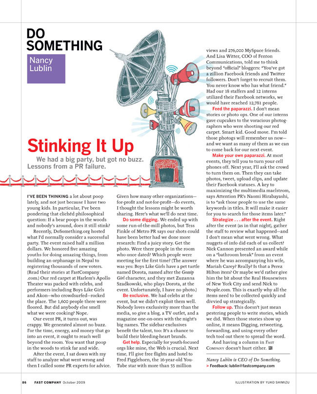
Fast Company Magazine (October 2009): Article
Final layout in the magazine. I drew a long red carpet so they can lay it out the way they like. Big thank you to Henry Young, Associate Art Director of Fast Company Magazine.

Drawing For Comic Books No.2

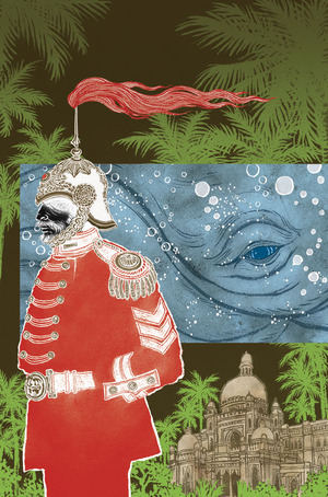
The Unwritten, Issue 5: Cover
Working as a cover artist for DC Comics Vertigo has been a whole different experience from my regular life as an editorial illustrator. And  I am having a lot of fun getting challenge to keep myself stimulated and to try out new things.For example, I work with editors instead of art directors, but editors in comic books deal with images, so they are sort of in a way in between editors and ADs. Other challenges include: change compositions and color schemes dramatically each issue, and yet keep the mood of the whole series throughout, reinventing characters that are drawn by interior artist and make them similar yet in my way, etc.The 5th issue of The Unwritten (written by Mike Carey, illustrated by Peter Gross) has just come out in comic book stores this week, and at my studio I am busy working on the 9th cover. (We work way ahead.)

It has been a while since I talked about the first cover, so I wanted to post about the latest issue. (The story of this issue deals with British colonization of India, Moby Dick and Mark Twain.)

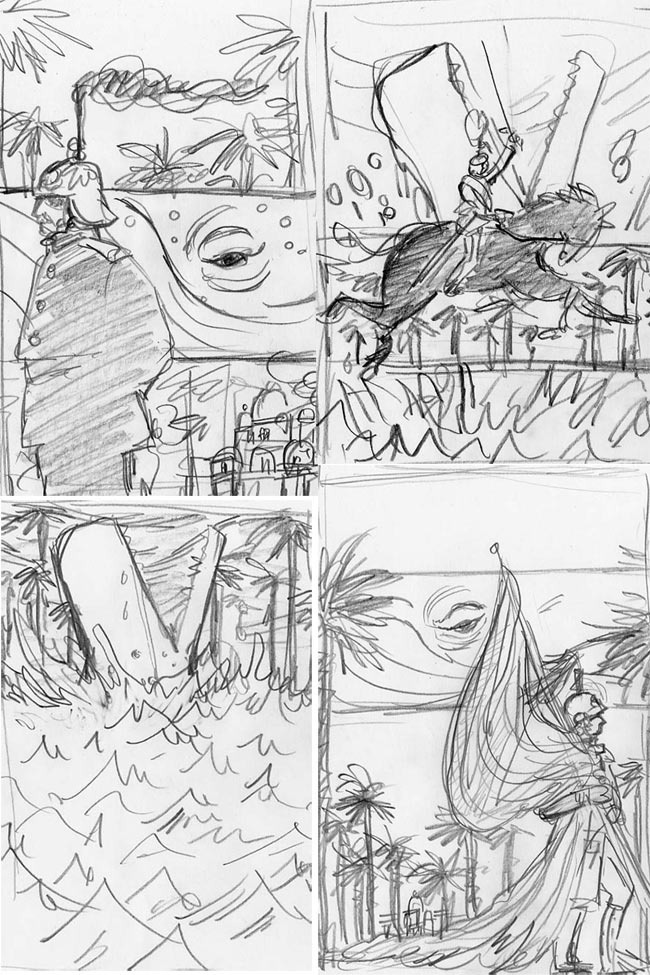
First step is thumbnails. I draw lots and lots of rough ideas. I am extremely neurotic about compositions, so I often draw the same idea over and over until I come up with a good composition. Of course, a lot of ideas won’t work and get ditched at this stage. I jot down keywords on the side of the paper which helps brain storming.
The Unwritten, Issue 5: Thumbnail Sketches
Four sketches are submitted. I am often unsure if any of them would work, and get nervous until my editor Pornsake Pichetshote calls me back. (Yes! My editor still makes phone calls!!)
The Unwritten, Issue 5: Sketches
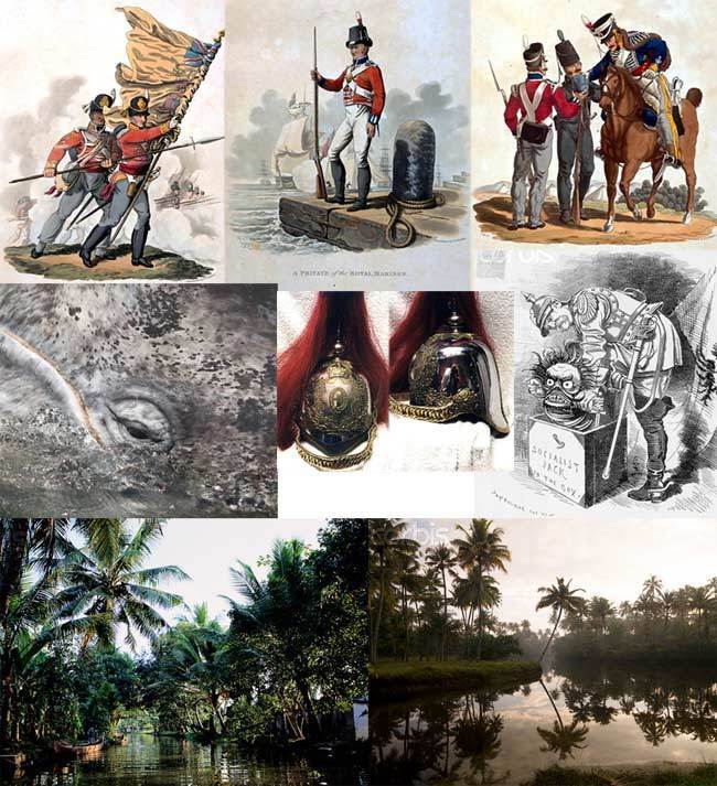
Some references and inspirations downloaded from internet. It is important for me to really ‘feel’ the environment I am drawing. So, the photos of Indian jungles are not just for reference, but also to help me getting into the mood of the far away place I have never been.
The Unwritten, Issue 5: British Colonization
I usually like to draw an illustration in one-shot, but in this image, it made sense to divide into four parts.
The Unwritten, Issue 5: Illustrations In Four Parts
Back by popular demand, screen shot of all my Photoshop layers.
The Unwritten, Issue 5: Photoshop Layers
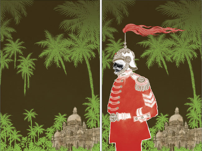
This illustration is in three parts. Background, the English man, and…
The Unwritten, Issue 5: English Man
… the whale eye layer-set finishes the image. Small bubbles were drawn separately as well, so the image is consisting of total of 5 separate drawings put together on Photoshop.
The Unwritten, Issue 5: Whale Eye
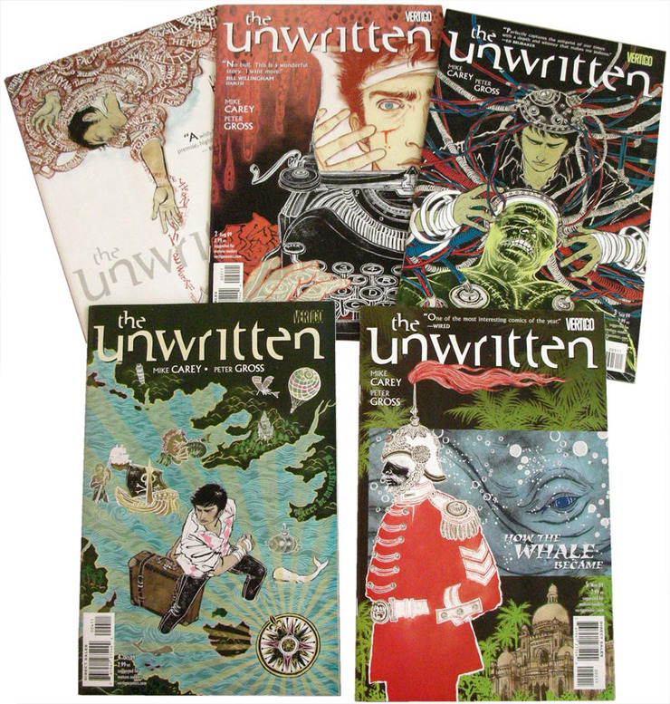
All the five covers published so far. Thanks to the fantastic team of Mike, Peter and Pornsak, and everyone else who’s involved in The Unwritten, the series is doing well, and the first two issues got completely sold out and went into the second printing. Yay.I will try and post processes of some of the older covers as well.
The Unwritten: Issue 1-5 Covers

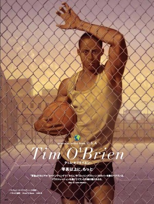
Interviewing Tim O’Brien

Tim O'Brien: Drawger Regular
I don’t miss at all my 11 years of corporate life before going back to art school. But it was not all bad either. I was in PR, so my job revolved around finding right people who have good stories. I did a lot of writing, mostly for company brochures and magazines for investors, etc. I have to admit I sometimes miss it.When my high school classmate and illustrator Tatsuro Kiuchi and Japanese Magazine Illustration asked me to contribute articles about American illustrators, I thought that was, in fact, a great idea. I can mix all my passion: illustration, writing, getting great stories out of great people, and besides I can introduce fantastic American talents Japanese people are not familiar with. (They are historically not so open to things outside of their own country).

Some of you already know about my first interview to Edel Rodriguez. The second was also Drawger regular: the one and only Tim O’Brien.

The only bad thing about this article writing is that because the Japanese article is rather short, I have to edit down a lot. So, I asked friend Penelope Dullaghan of Illustration Friday to post the original length article in, yes, English!

Please read an inspiring interview to Tim here.

Thank you Tim, thank you Penelope.

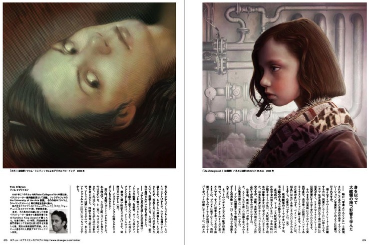
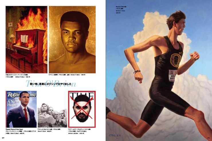
Japanese Illustration Magazine: Spread 1
Japanese Illustration Magazine: Spread 2
Sneak peek of the Japanese Illustration magazine spread pages. The issue will be available in Japan in late September.

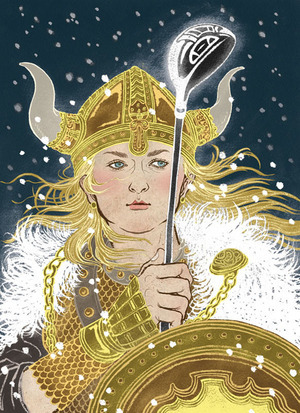
Viking Queen Plays Golf

Viking Queen Plays Golf: Anna
The idea of “golf” still have that old-fashioned feel. You know, rich executives, exclusive and conservative… But under Creative Director Ken DeLago, the art department at Golf Digesthas been successfully reinventing that old-school idea.When Associate AD Marne Mayer called me for a portrait of a young Swedish golfer Anna Nordqvist, she made it clear: “Let’s do a portrait that would surprise the traditional readership!”  Her request was to “draw Anna as a Viking queen”.

“You mean, metaphorically or literary?”

“Well, it can be either way. Have fun!”

So, I ended up coming up with an idea of making this illustration almost like a fantasy book cover, really over the top. Only that she is holding a golf driver, not a sword.

Have fun, right? I was a sci-fi/fantasy geek back in my tween days.

And, OK, back to school special!

For all the illustration majors starting school in a few weeks, more detailed creative process on this post….
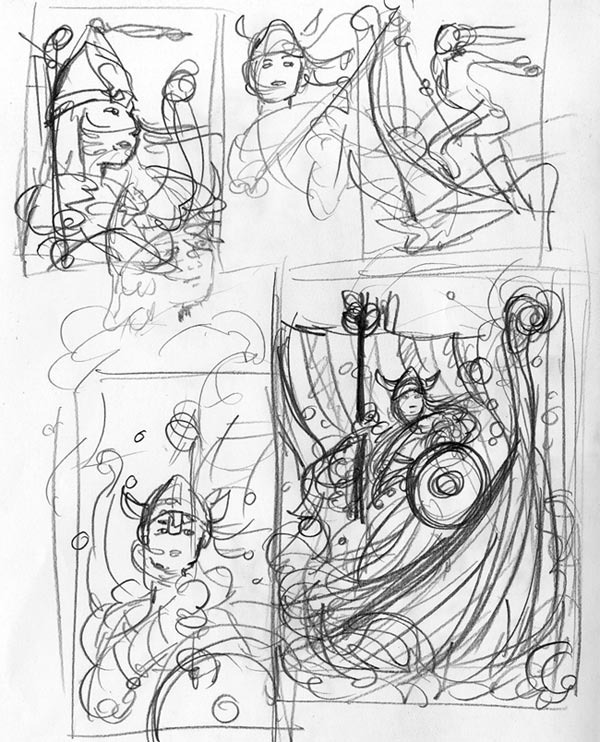
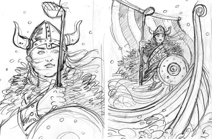
Viking Queen Plays Golf: Thumbnail Sketches
Process starts from thumbnails. Lots of them. Good drawings only come from lots of bad drawings, kids. Draw, draw, draw.I usually draw thumbnails with pencil on photo-copy paper. (very easy to organize and file away the sketch piles after each job is done). No eraser while doing roughs. Art students, eraser is your enemy. Eraser makes your drawing meek. Throw away your erasers before the school starts!
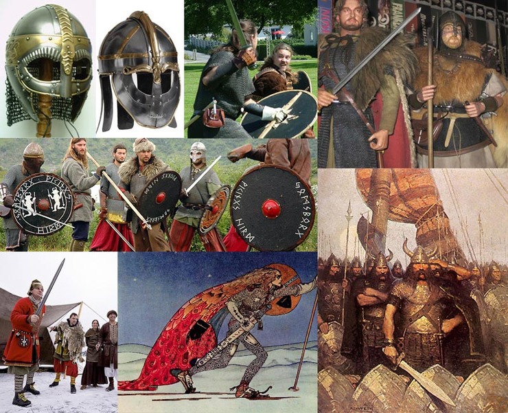
Viking Queen Plays Golf: Museum
Don’t forget the reference materials! Never copy one single picture is a rule. All the photos are copyrighted to someone, just like your drawing/painting is copyrighted to you. These are some of the photos I downloaded online. Viking museum snapshots to geek costume-play (!!!) to the illustration star of Scandinavia Kay Nielsen’s work…By the way, these are maybe 1/5~1/10 of all the reference materials I have gathered from different sources. The more, the better understanding you get of the subject matter you are illustrating. (All photos are copyrighted to the original creators. Thank you.)

Viking Queen Plays Golf: Sketches
Two sketches were submitted. Let’s always give options to the client (and to your teachers, especially!)By the way, I DO know that the real Viking helmets don’t have horns. But we decided to add them anyway to make the concept more clear to American audience. (Eraser is acceptable here.)

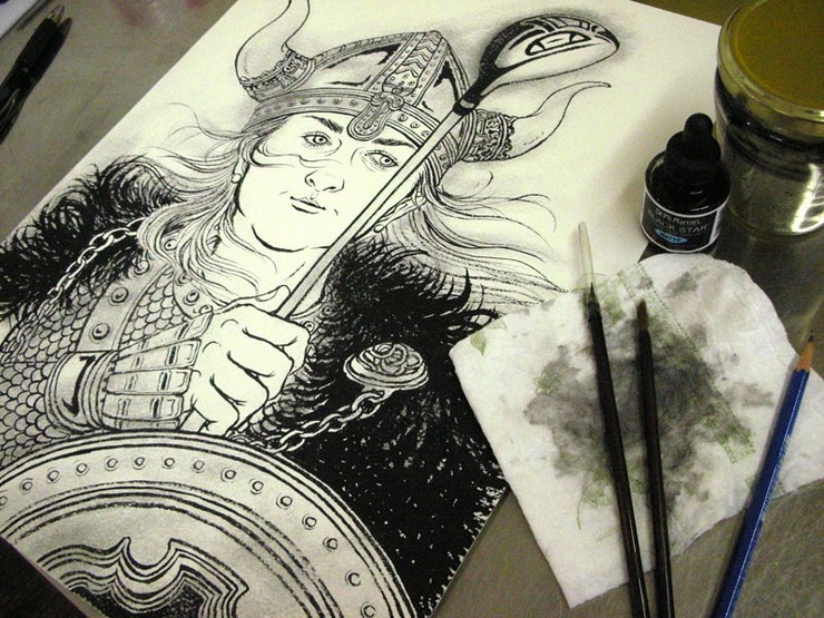
Viking Queen Plays Golf: Watercolor Version
Then, to the drawing table. Dr. Ph. Martin’s Black Star is the ink of my choice. Japanese calligraphy brushon watercolor paper. Drawing is about 13”x17.5”. My drawings are really loose, so I usually draw around the double the printing size or bigger.*(By the way, I added this part later) I just found out that Kinokuniya Bookstore in New York carries decent number of various Japanese calligraphy brushes, and they actually carry the one I use. For those who are interested in trying them out.)
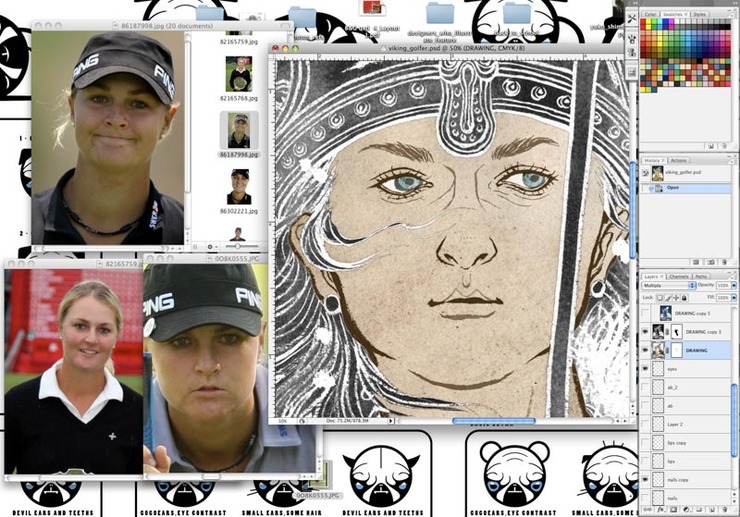
Viking Queen Plays Golf: Adobe Photoshop 1
Drawing gets scanned in and next step is the Photoshop coloring. I seldom fix my drawing on the computer, but of course there are exceptions.I open up the references (the magazine sent them to me) and really nail her likeness by very minor rescaling and moving of the facial parts. I call this process “plastic surgery” (always works!). Also softened some of the lines on her face to enhance her soft, young and fair feature.

(By the way, the cute wallpaper on my computer was made by one of my Venetian student Michele. It is his beloved pug. Cute, eh?)
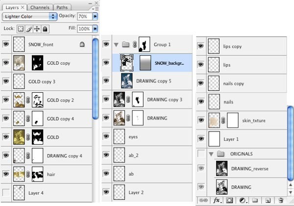
Viking Queen Plays Golf: Adobe Photoshop 2
OK, yes, ‘back to school special’… !Here are all the layers involved in coloring this illustration (which I normally don’t show). About 25 layers here; which are not as many as my illustrations usually have. This is a rather simple composition, so I was able to keep my layer count low. I think my average is about 50 layers. (I know. Some of my friends call me crazy.)

There are lots of ‘secret layers’ that are so slight viewers won’t even notice. But those are the ones that make the final image work. Final layered PSD file size here is about 700MB, which is also smaller than my avarage of about 1GB.

Viking Queen Plays Golf: Anna
Final illustration: my ‘faux Viking fantasy book cover’. Yay.
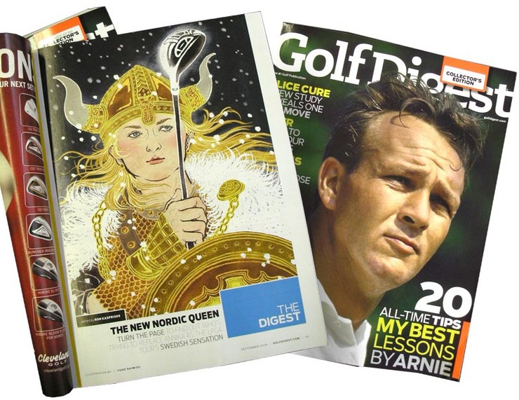
Viking Queen Plays Golf: Golf Digest Magazine
Magazine page layout. September issue of Golf Digestis in newsstand now. Thank you Ken and Marne.And, all the art students, welcome back to school! Another year of productivity to come.

Photoshopping In The Beginning Of Time (Of Photographs)

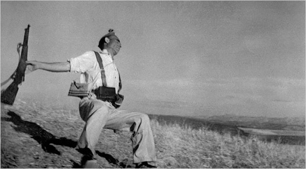
Magnum Photos: Robert Capa
Robert Capa/Magnum PhotosInvention of Adobe Photoshop sure made it so much easier to manipulate photos. And a lot of us, illustrators, rely on the power of what Photoshop can do. I am one of them.

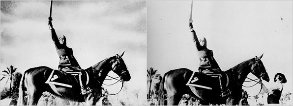
I wanted to share this very interesting NY Times article from this morning (Sunday, Week In Review Section) Faked Photographs: Look, and Then Look Again. What we call ‘Photoshopping’ (i.e. manipulating photos) and fake photographs are not just on the cover of contemporary glossy magazine.
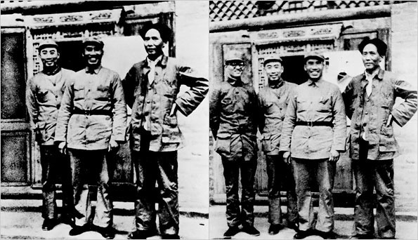
Read the full article here. See the slide show here.

(all the photos here are borrowed from NY Times site.)

New York Times: Faked Photographs: Look, And Then Look Again 1
New York Times: Faked Photographs: Look, And Then Look Again 2
New York Times: Faked Photographs: Look, And Then Look Again 3
New York Times: Faked Photographs: Look, And Then Look Again 4

Teaching In (HOT HOT) Venice!

Teatrio: Front
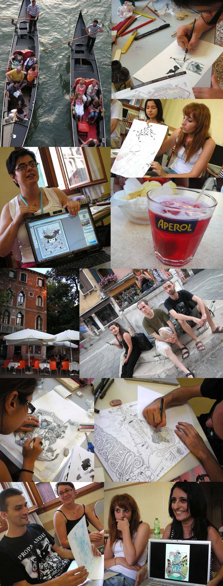
Venice was HOT. I mean, really…While I was teaching a six day illustration workshop in the last week of July with a local illustration organization Teatrio, the city recorded “the hottest day of 2009”.  In Italy, people don’t really believe in air conditioning. Summer is hot and you just sweat, like good old days. But with 13 students in a classroom? At first, I was not sure if I was able to survive.It turned out to be one of the best teaching experiences I had ever had.

How much can I teach in just 6 days?

I was a bit nervous at first. My job as a teacher is to let them get their money’s worth. But soon, I realized, sometimes short intensive time together can be a lot more effective than teaching once a week for one full school year.

How I try to teach is to work on each student’s strength and weakness. The crucial part is how much students and I can get to know each other in a short period. And this intensive time worked to our benefit.

We spend all 6 days together. Other than class time, we had morning café latte together, had lunch together, ate dinner together and sometimes had drinks late into the nights. Not that we had to, we just wanted to. And by the end of the course, we all felt as if we were the oldest friends! It was really sad to leave.

Thank you everyone. You were not the only ones who learned in those six days. You all taught me a lot to be always be passionate and love what I do, work hard, and also trained me to be a better teacher. Hope to see you again soon. And, I hope to go back to Venice again for another workshop.

Teatrio: Students 1
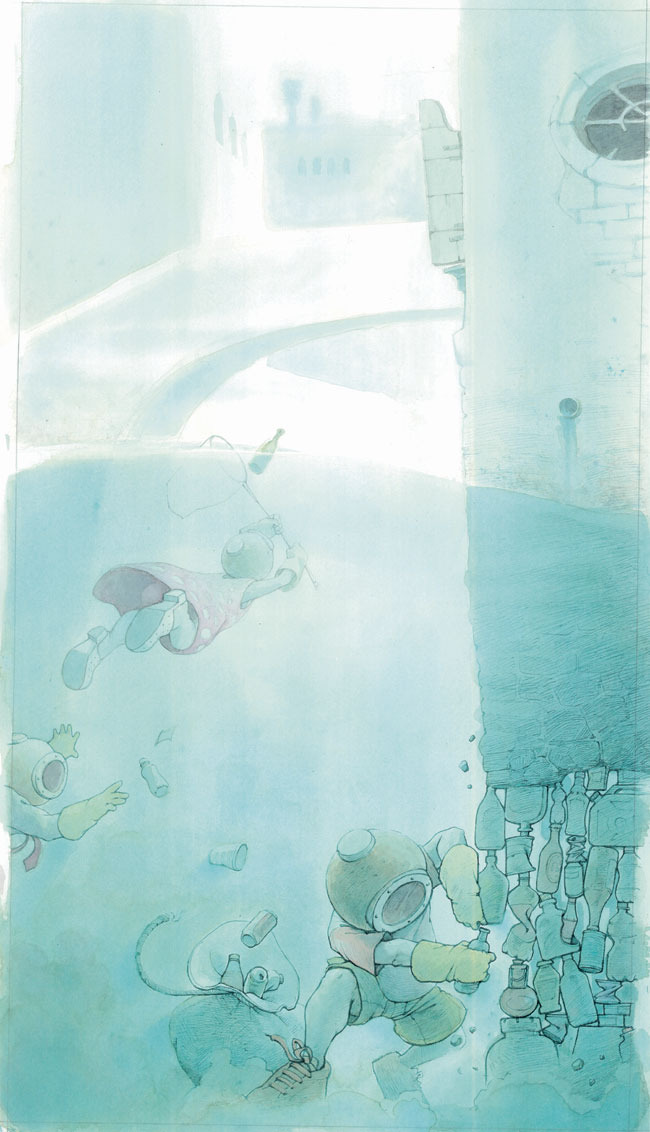
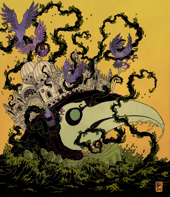
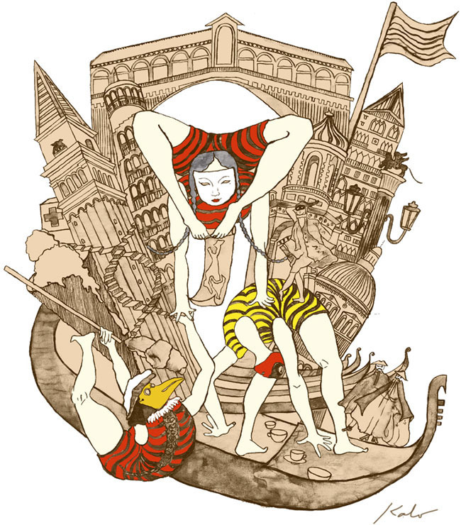
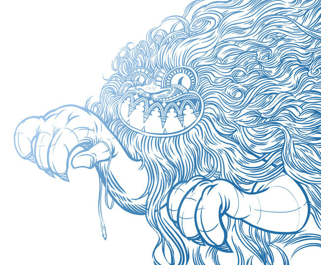
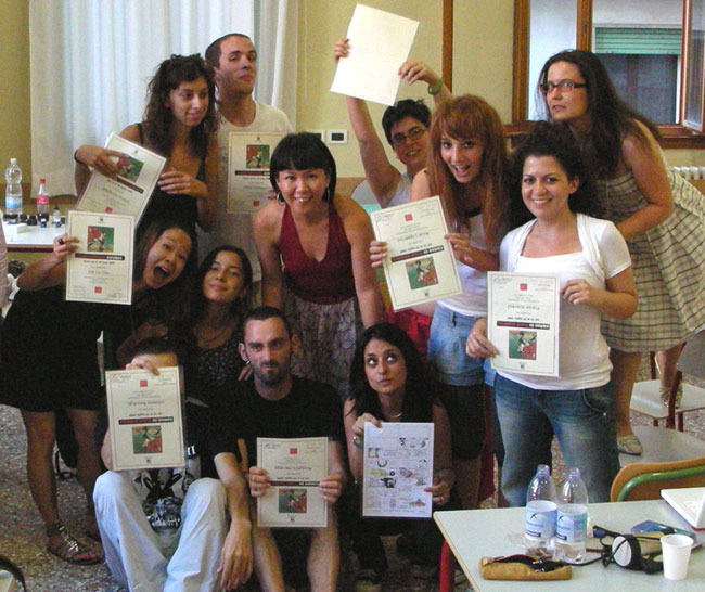
The students were mostly Italian with one Canadian and one British, age and level all varied, from some in middle school all the way up to professional illustrator level. Everyone was just so nice, motivated, hard working and helpful to each other. A few of the students even decided to stay in the school whole night before the last session, so they can finish the assignment. (I did not make them stay, everyone!)The assignment I gave this year was “create a superhero who saves Venice from sinking underwater”. We didn’t have good internet connection, but with this project, they were able to find inspirations and references all over the city!
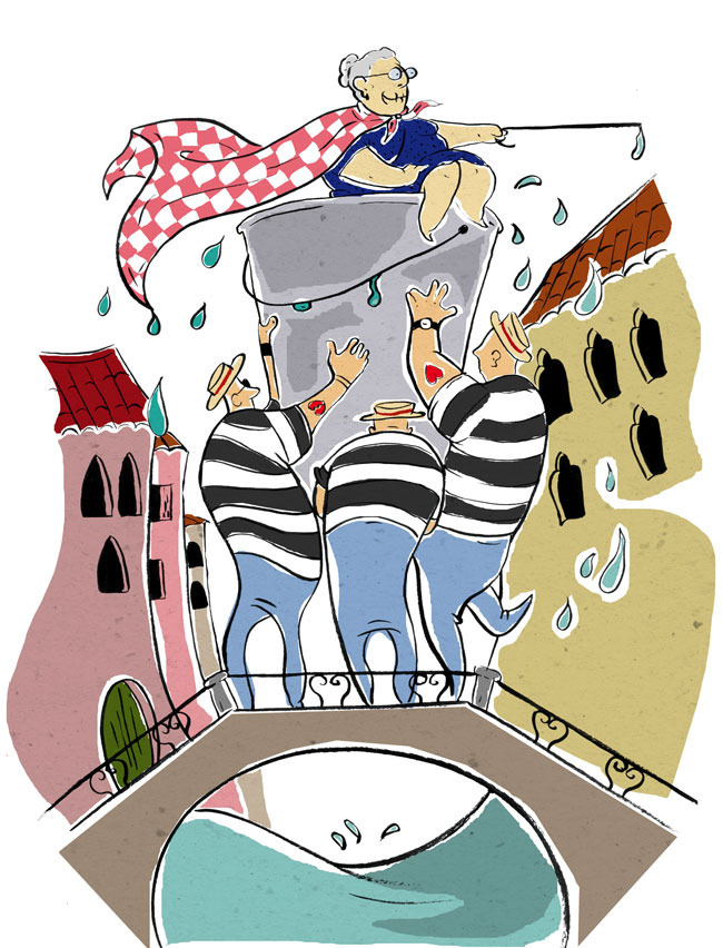
Teatrio: Ilaria Grimaldi
Ilaria Grimaldi saw an old woman on the street, imagined her long life in Venice, then turned her into the superhero.
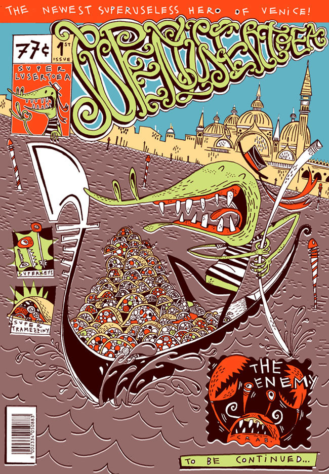
Teatrio: Ruggero Asnago
Ruggero Asnago got addicted to Venezian sandwitch Tramezzini, suffered from tight curfue of hostels, and turned a gecko into superhero who has lots of ‘useless’ powers.
Teatrio: Beatrice Davies
Beatrice Naomi Davies’ heroes use bottles and cans to rebuild the city’s old base. By the way Beatrice just finished high school and hoping to apply to art college in the US next year. What a talented young woman!
Teatrio: Peter Diamond
Peter Diamond used old plague doctor mask and San Marco. Peter is a Canadian now lives and works in Vienna, Austria.
Teatrio: Flavia Soprani
Flavia Soprani‘s idea was vain-like canals turning into a big tree with bridges. I love that everyone’s work and styles are so different!
Teatrio: Kalo Chu
Kalo Chu made herself into Chinese acrobats, balancing and lifting the city as well as all things she experienced during her stay in  Venice. Kalo is Chinese from Hong Kong now lives and works in London, UK.
Teatrio: Michele Boscagli
Michele Boscagli turned signature Venice architecture into a monster of his own creation.
Teatrio: August 2009 Class
All the students (and me) with their certificates of finishing the course.

Visualizing Nightmares

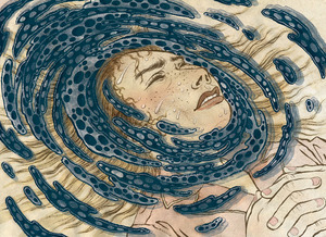
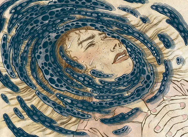
Bostonia Magazine (August 2009): Colored Version
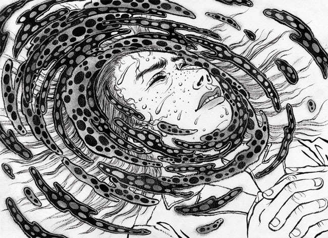
Drawing nightmares is tricky.It is easy to draw a nightmare you had last night, but when it comes to drawing the bigger ‘idea’ of nightmares, all of a sudden, it is not that visual.
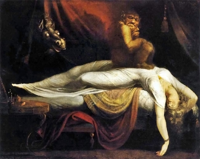
Besides, there is this iconic nightmare painting already exist by the master of the genre: Fuselli (please see below).

When Ronn Campisi, an AD who works with multiple publications around Boston area, called me for an assignment on this topic for Bostonia Magazine (alumni magazine of Boston University), it was a bit of struggle at first.

After getting rid of really cliché ideas that initially came and went in my head, I settled with two rather simple ideas of drawing the gloominess of the experience of nightmares rather than trying to illustrate too literary.  And, I tried to stay away from Fuselli imagery as much as possible.

We were pretty happy with the final result. This illustration got accepted into this year’s Communicaton Arts illustration annual, which was a nice surprise at the end.  Thank you Ronn and CA!

Bostonia Magazine (August 2009): Fuselli
The ultimate icon of nightmare images by Fuselli
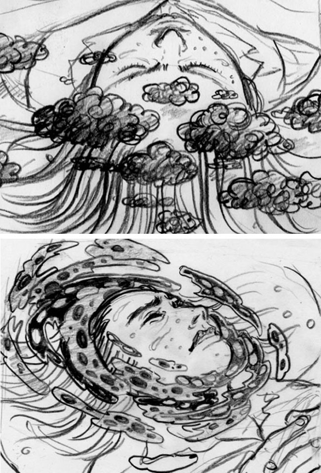
Bostonia Magazine (August 2009): Sketches
Two sketches. I could have done either one of them, but the bottom one probably had a better composition.
Bostonia Magazine (August 2009): Watercolor
Drawing as it was scanned in. Black india ink on watercolor paper.
Bostonia Magazine (August 2009): Swirl
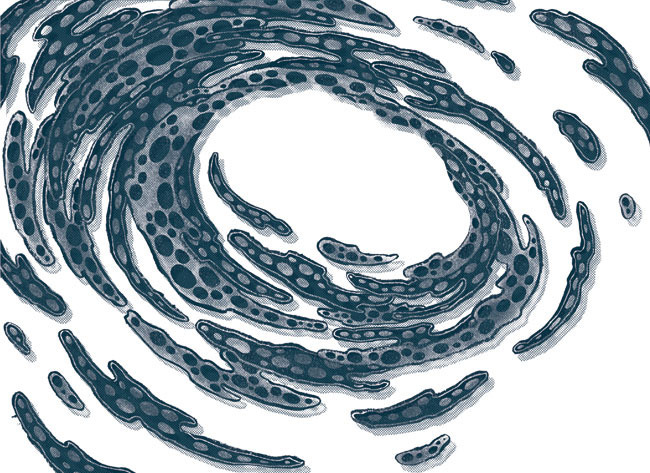
Then using Photoshop I tediously cut out the swirl part to pop it up more from the rest of the drawing.
Bostonia Magazine (August 2009): Final Artwork
This is the final colored version.
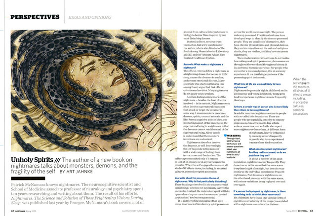
Bostonia Magazine (August 2009): Spread
Bostonia Magazine page layout. Ronn did an amazing job, and the illustration got accepted into this year’s Communication Arts illustration annual. Thank you Ronn!

Reality Check!

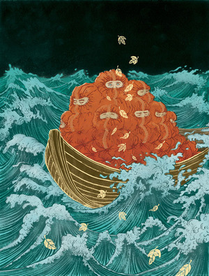
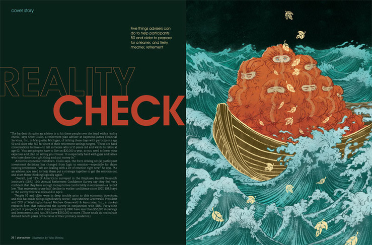
Plan Adviser (August 2009): Illustration
“Reality check: things are not looking so great when you wake up.”This was the line I received from AD SooJin Buzelli to come up with this illustration for PLANADVISER Magazine.

What I love about working with SooJin (as all the fellow Drawgers know) is that she knows the illustrators do our best job when we have the biggest freedom.

Well, to be honest, I thought maybe this idea was a bit too out-there, but she didn’t seem to mind it!

By the way, side track… I am still learning how to be a better blogger… I have only posted one (ONE!) post last month.. I am trying to be better at posting from now on…

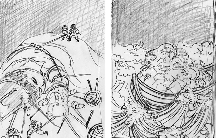
Plan Adviser (August 2009): Sketches
Two sketches submitted. I really didn’t mind working on either one. The other one may have been fun too.
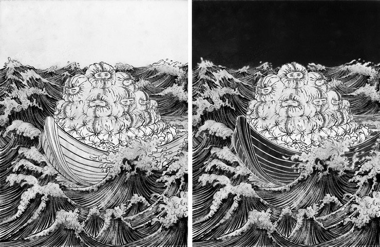
Plan Adviser (August 2009): India Ink With Japanese Calligraphy Brush On Watercolor Paper
Next is the drawing stage. India ink with Japanese calligraphy brush on watercolor paper. Original image size is about 17″ x 22″. Yes, I draw quite large… The left is the original drawing as it was scanned in. The right is after the basic Photoshop value tweak before proceeding to the actual coloring stage, which is a time consuming process, but necessary to make the colors work well in the final.
Plan Adviser (August 2009): Revision
SooJin only asks revisions if it is absolutely necessary. The very small, but very effective revision she wanted was to drop the blue color of the ocean into the kid’s eyes, so they pop more. Totally worked. Thank you SooJin.
Plan Adviser (August 2009): Final Submission
Final illustration. I added the golden leaves for compositional purposes, and also to enhance the concept.
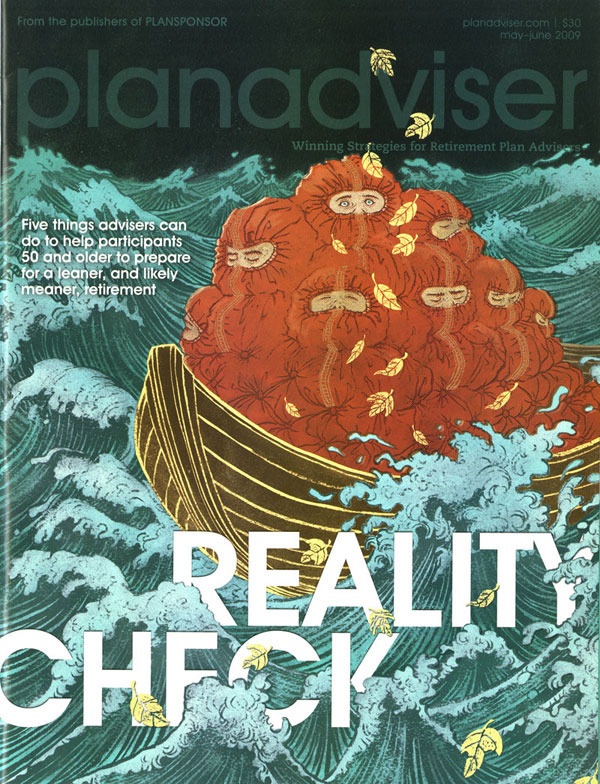
Plan Adviser (August 2009): Cover
Final cover. I love how the type is doing hide-and-seek in between the waves.
Plan Adviser (August 2009): Spread
Interior spread layout.